We create brands that are deeply connected to vision, rich with meaning, and crafted to inspire, align, and endure. Beautiful Brand Intelligence.
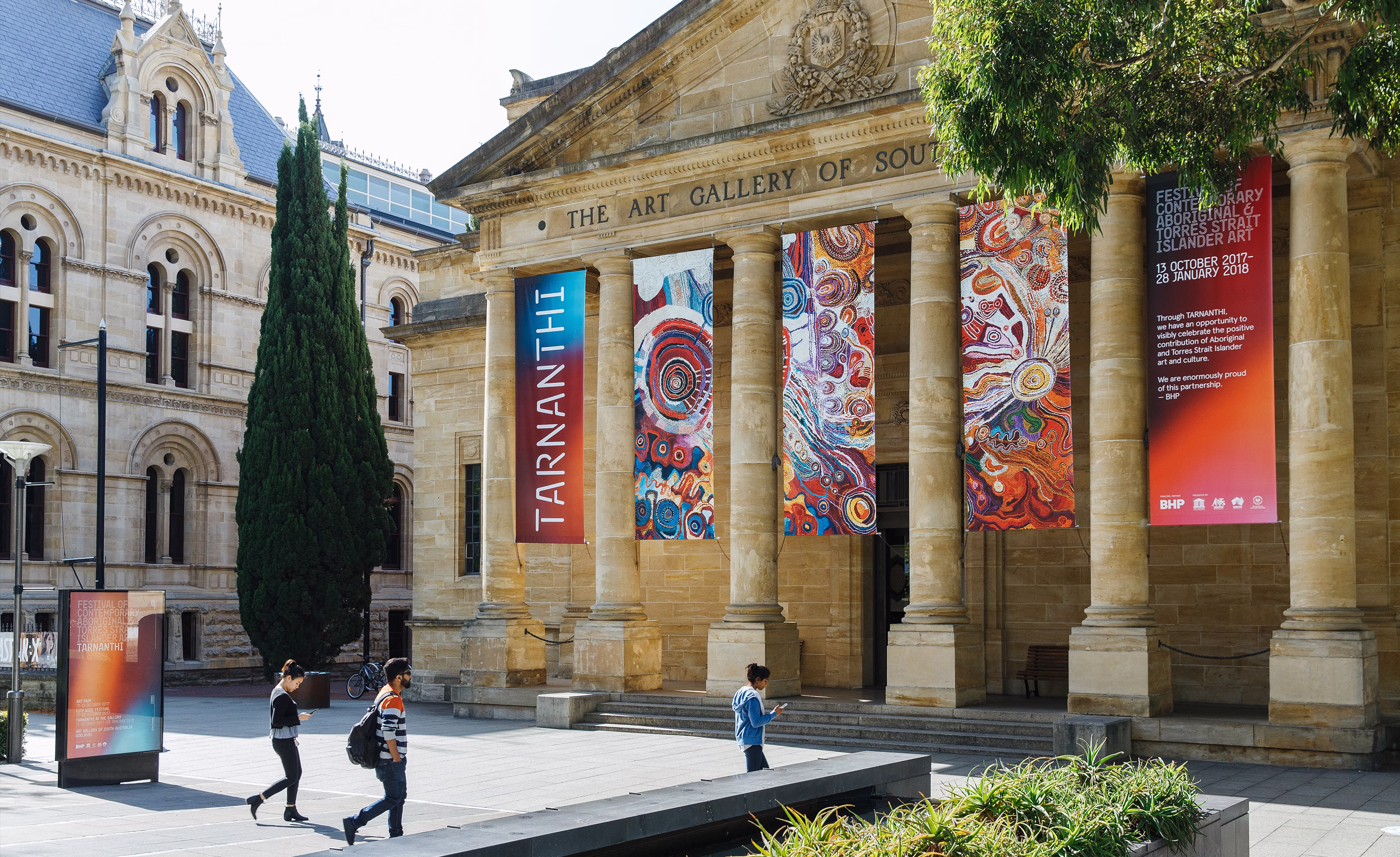
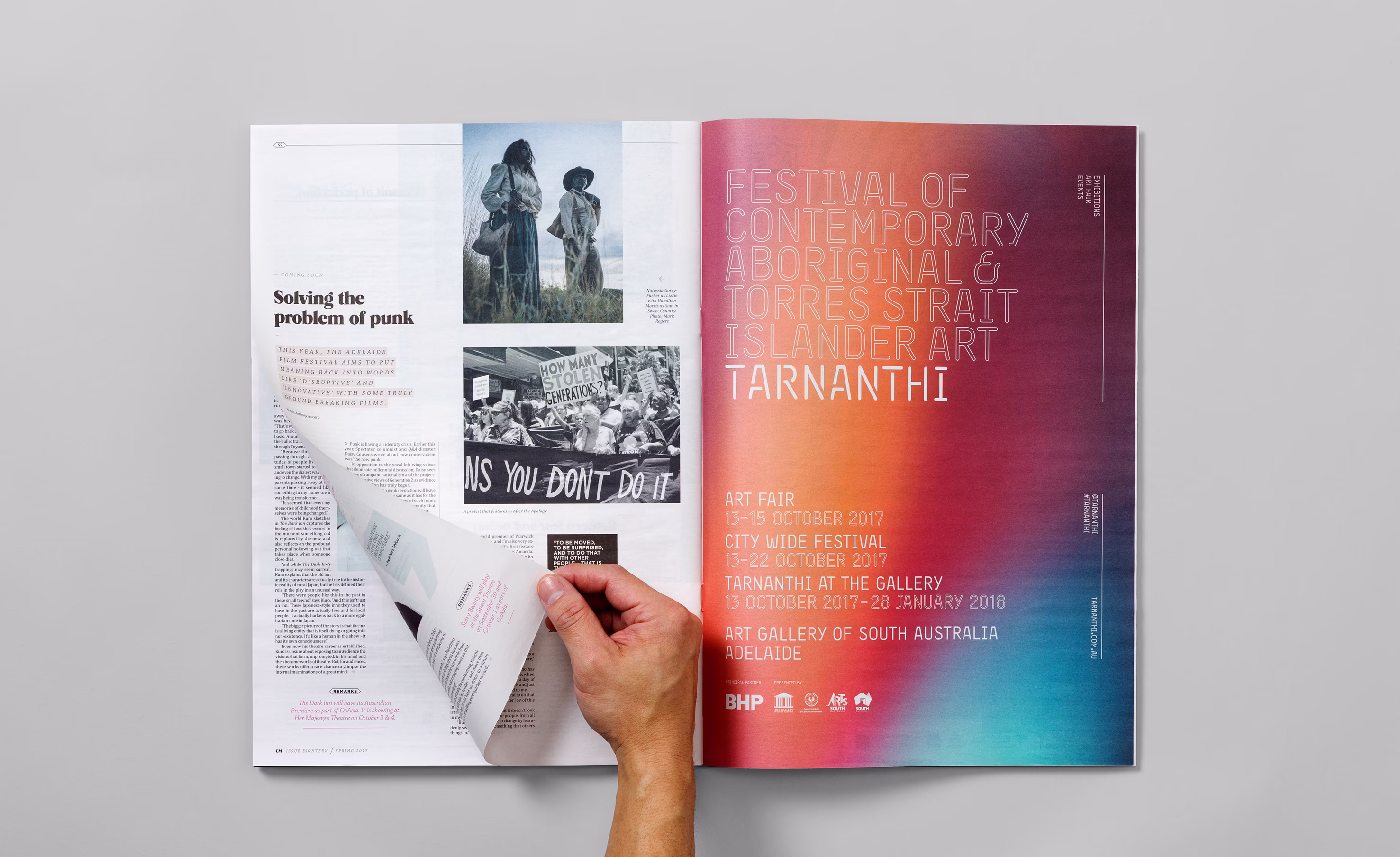
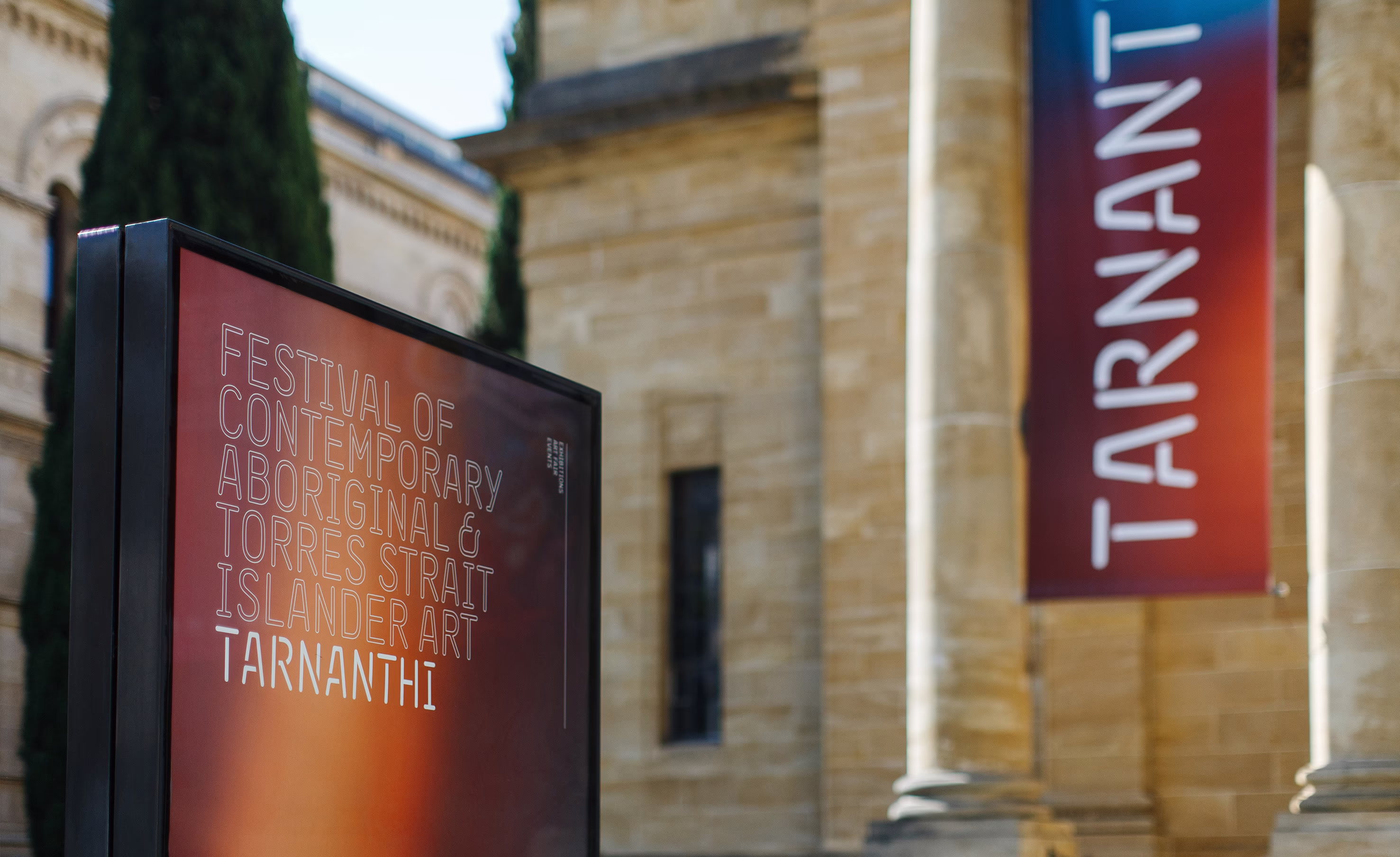
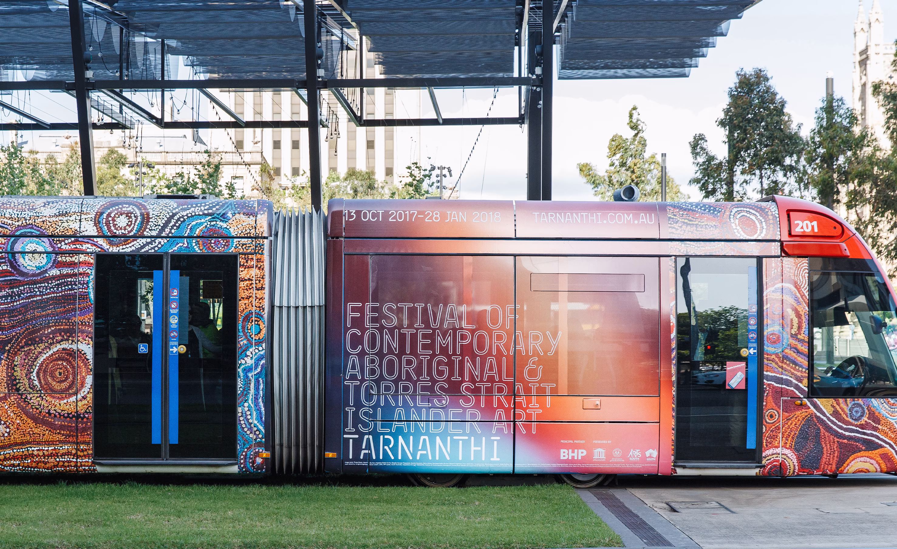
Tarnanthi is the Art Gallery of South Australia’s landmark festival of contemporary Aboriginal and Torres Strait Islander art. The brief was clear: create an exhibition brand and campaign that educates the public, respects culture, and invites broad audiences into a contemporary conversation.
Tarnanthi is a Kaurna word meaning to come forth or appear, like first light. That idea of emergence guided our strategy and creative system, shaping how identity, messaging, and media worked together to build salience and reduce perceived barriers to attendance.
Art Gallery of South Australia
The Arts
Exhibition brand identity and graphic system
Campaign art direction and key visuals
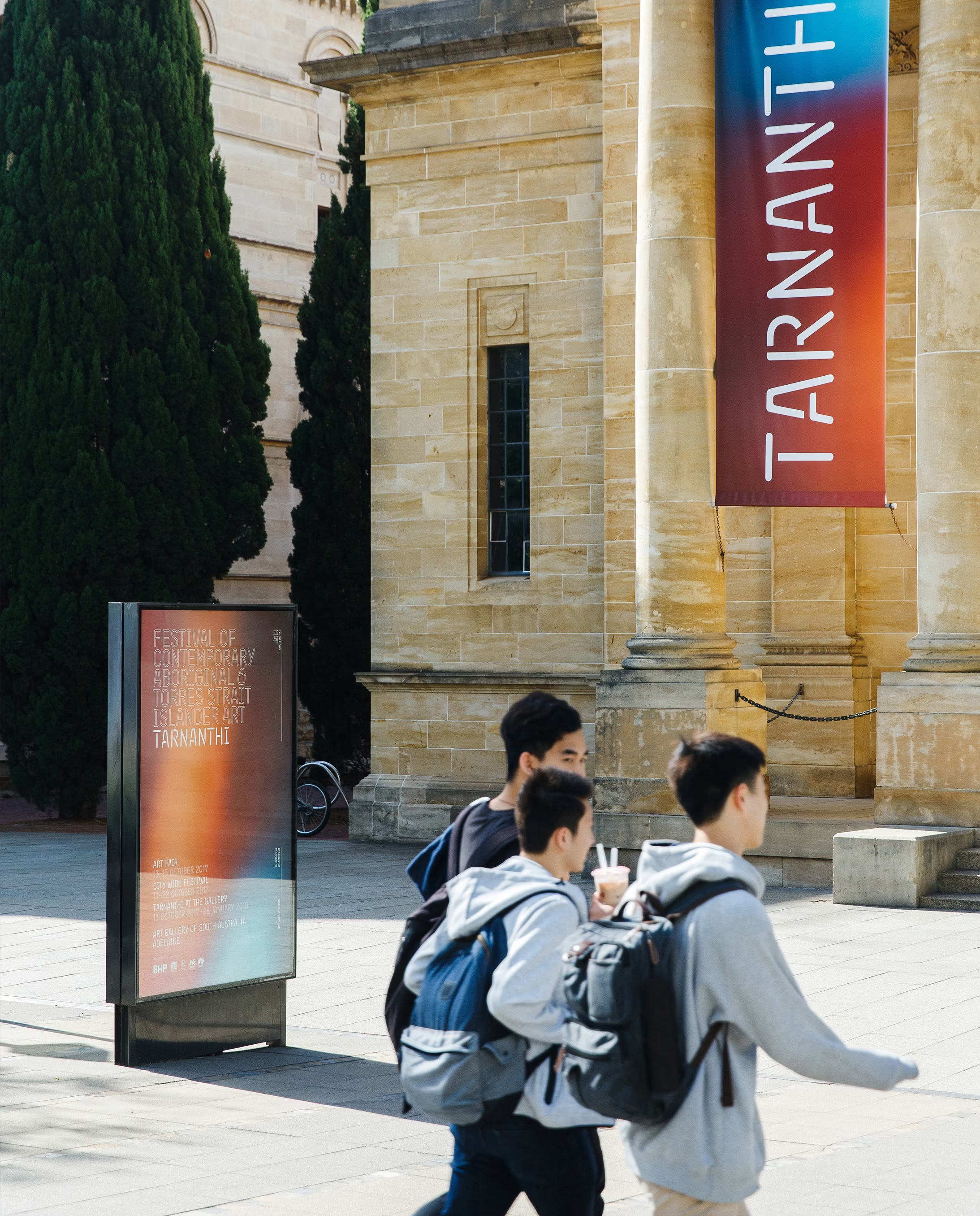
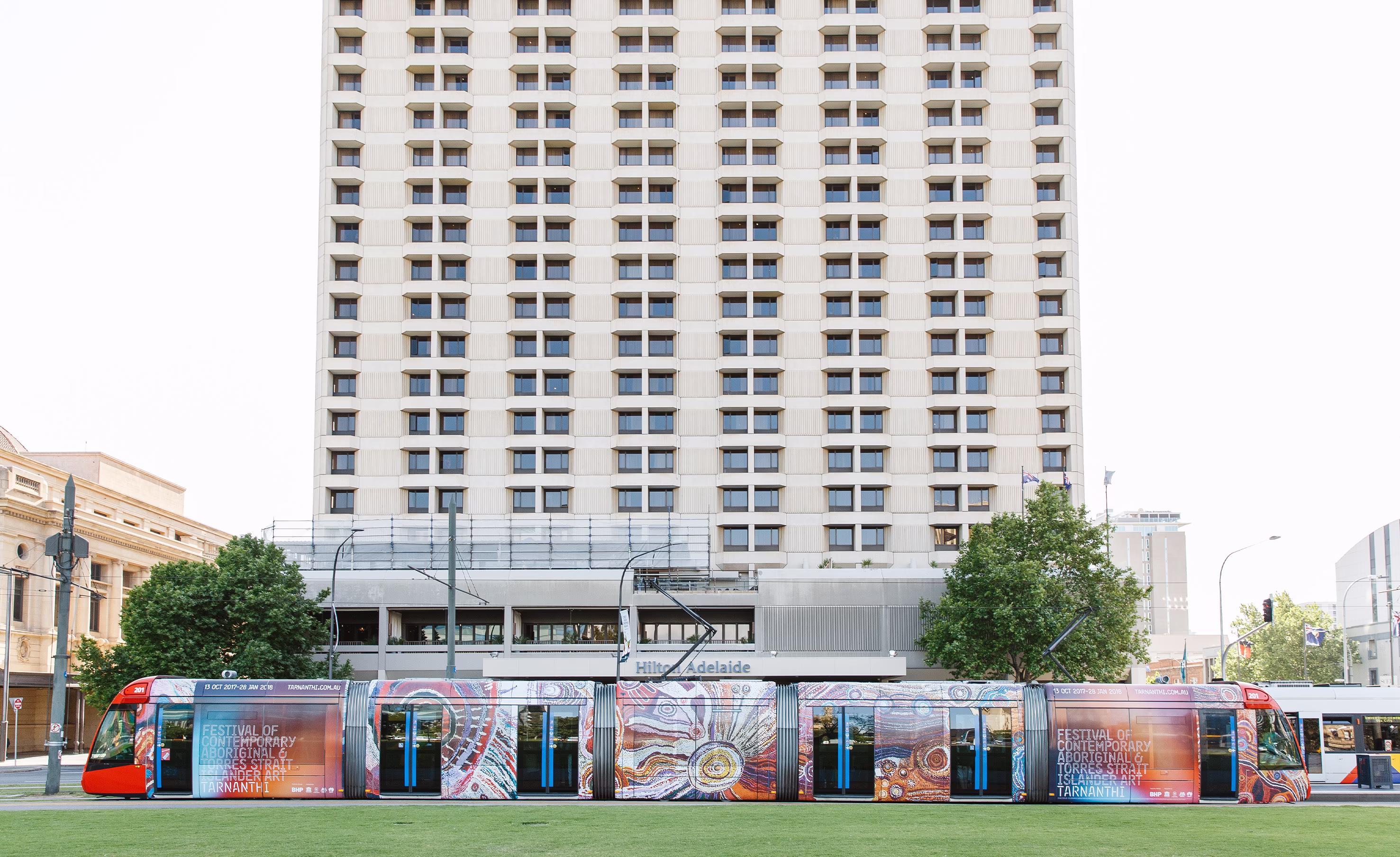
Outdoor advertising and large format
Digital display and social assets
Website and event page assets
Print collateral and press templates
Gallery wayfinding and signage toolkit
Campaign guidelines and rollout support
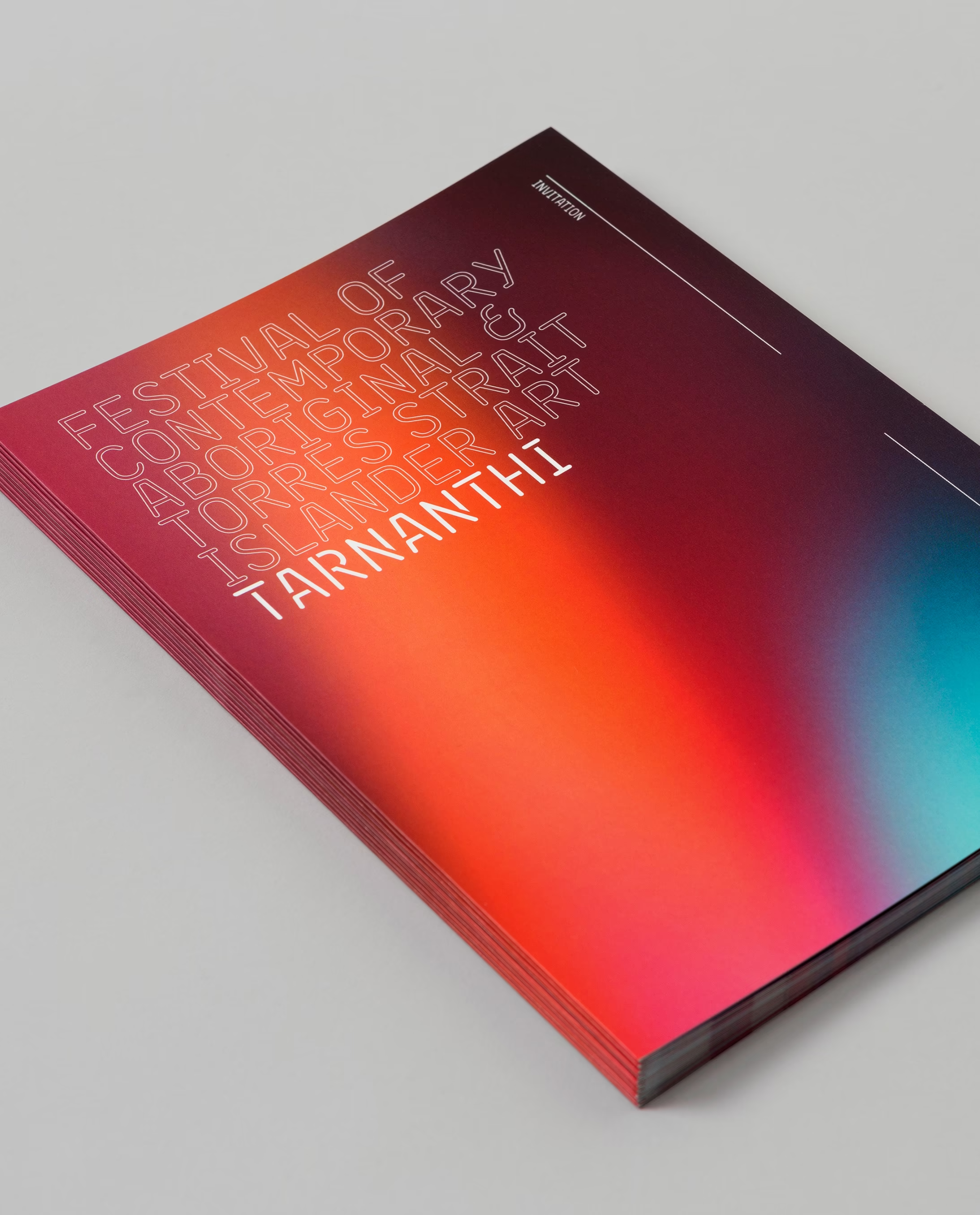
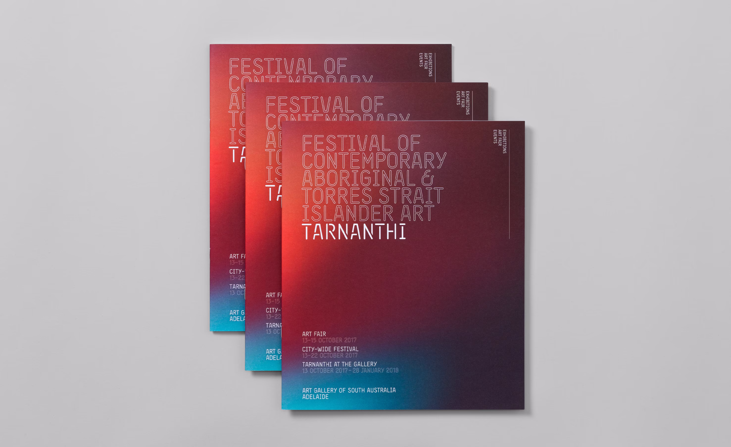
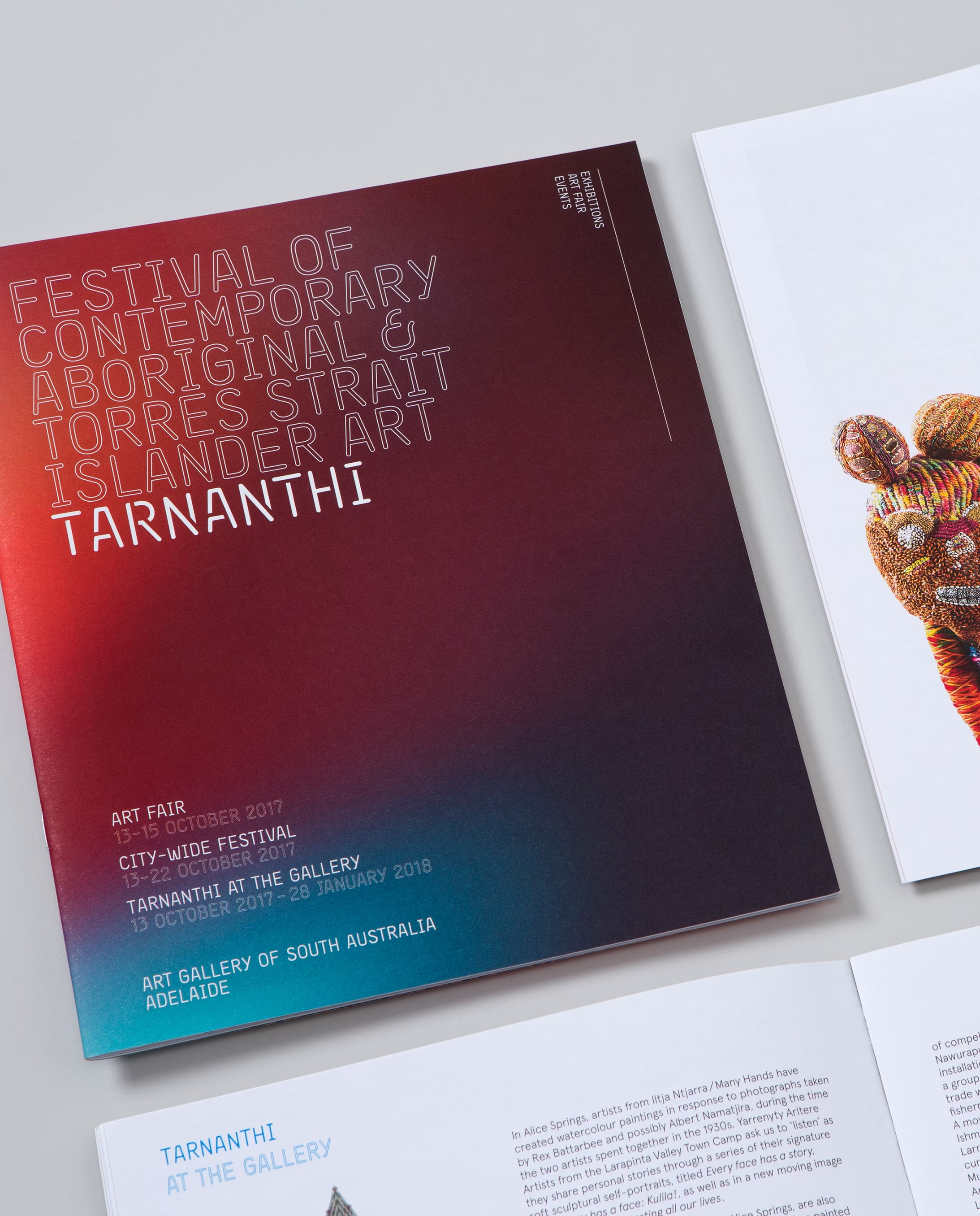
Capturing light through bokeh produced a distinctive gradient system that echoed the festival’s meaning. Contemporary typography and grid discipline ensured readability, cohesion, and a recognisable look in crowded media. The result was a campaign that felt unique and progressive, signalling future rather than past, and performing strongly across brand and response channels.
Most arts campaigns default to cliché or archival tropes. Tarnanthi needed to feel current and expansive, not reductive, while remaining respectful and accurate. The brand had to operate as a system across out-of-home, digital, and gallery environments, bridging seasoned gallery-goers and new audiences through clarity, warmth, and contemporary design principles.
We anchored the creative in the meaning of Tarnanthi, building a visual language around emergence and light. Using photographic bokeh to suggest first light, we created a gradient-led backdrop that felt alive, optimistic, and future facing. A modern, structured typographic approach provided contrast and legibility at distance while scaling elegantly across formats.
This avoided stereotype and positioned the festival as progressive and welcoming. Consistent distinctive brand assets improved mental availability across touchpoints, supporting discovery and conversion. The campaign proved highly effective, contributing to increased attendance and engagement across the festival period.

Tarnanthi demonstrates how a meaning-led, systemised identity can grow a cultural platform. By aligning language, light, and layout, we delivered a campaign that looked contemporary and behaved strategically, helping more people step into the festival with confidence and curiosity. If you are planning a major program or season and want a brand that performs across every touchpoint, we can help.
Jonathan VDK