We create brands that are deeply connected to vision, rich with meaning, and crafted to inspire, align, and endure. Beautiful Brand Intelligence.
Kennedy Property Services had a reputation, but not a brand. After three decades in property maintenance, new owners Jess and Jeff Bond wanted to evolve into a fully fledged construction business—covering commercial fit-outs, construction management, and maintenance.
The challenge was twofold: shift market perception from a legacy, relationship-led operation to a modern, capability-led company, and build distinctive assets that could work hard across vans, uniforms, sites and screens. We created a strategy-led brand system that turned their mobile fleet into moving media, unified every touchpoint, and signalled the company’s step-change in ambition and service breadth.
Kennedy Property Services
Construction & Building
Brand strategy
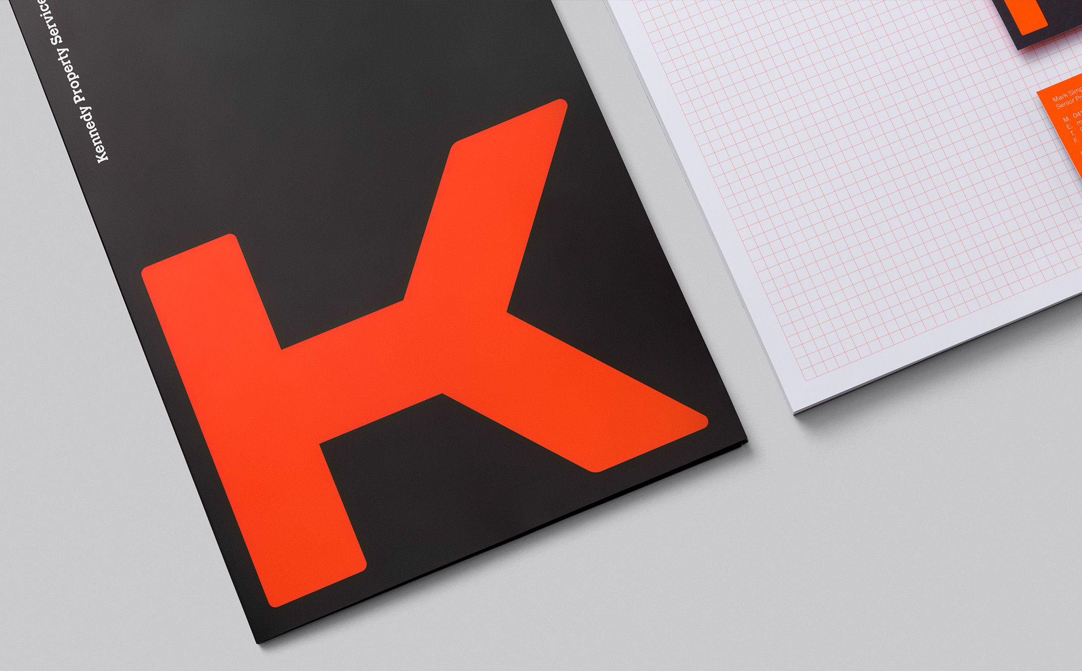
Brand identity and design system
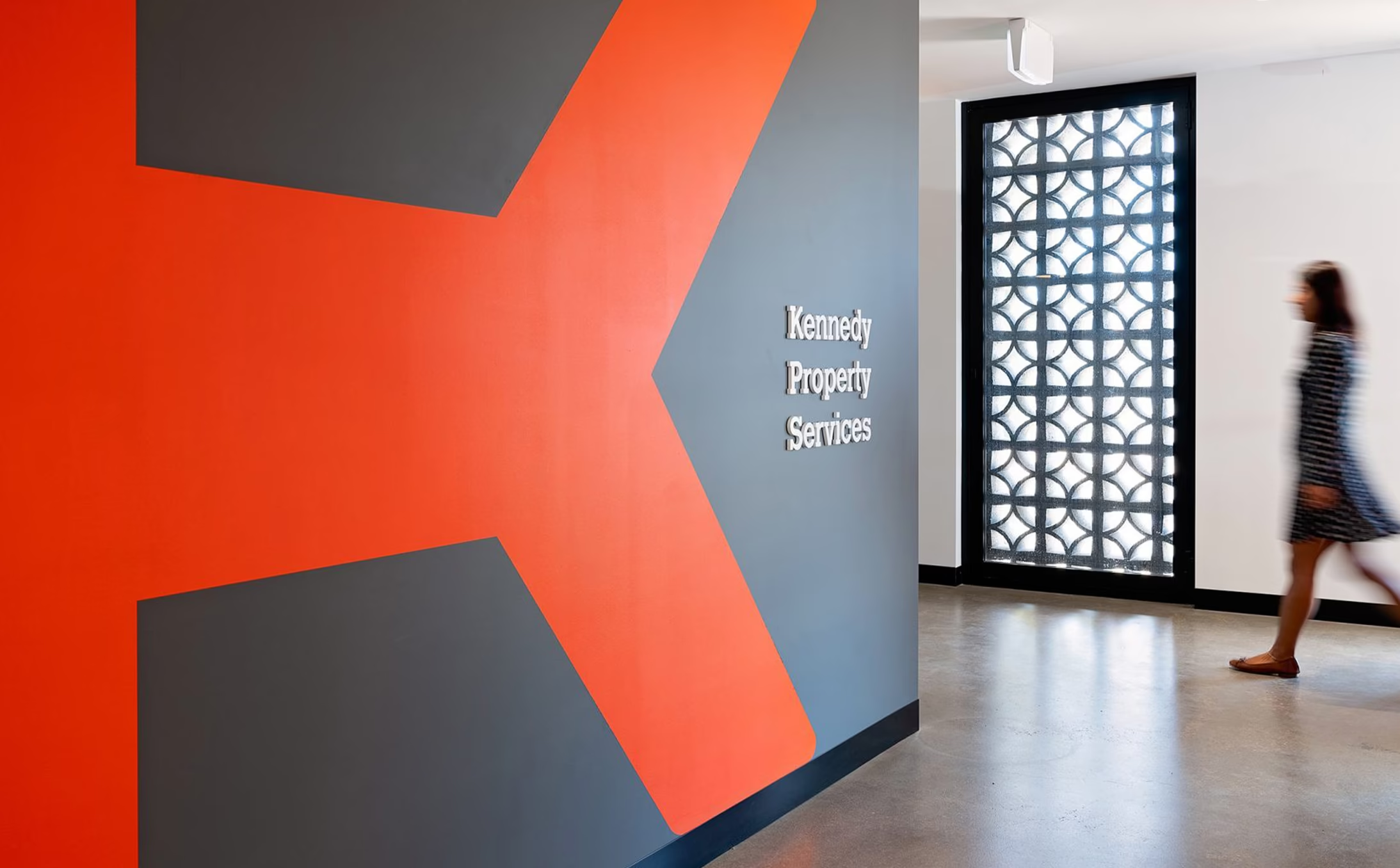
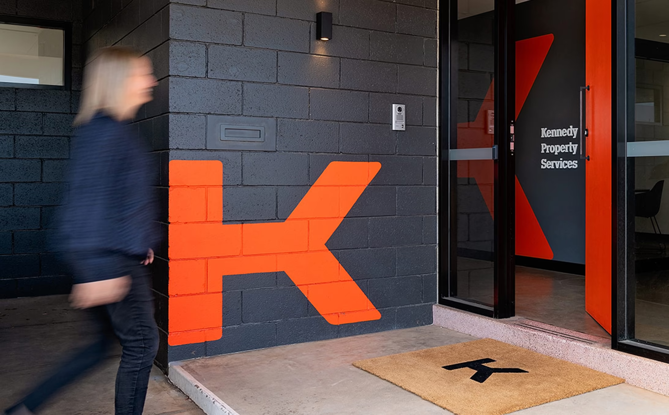
Signage and site applications
Vehicle livery
Website design
Uniforms
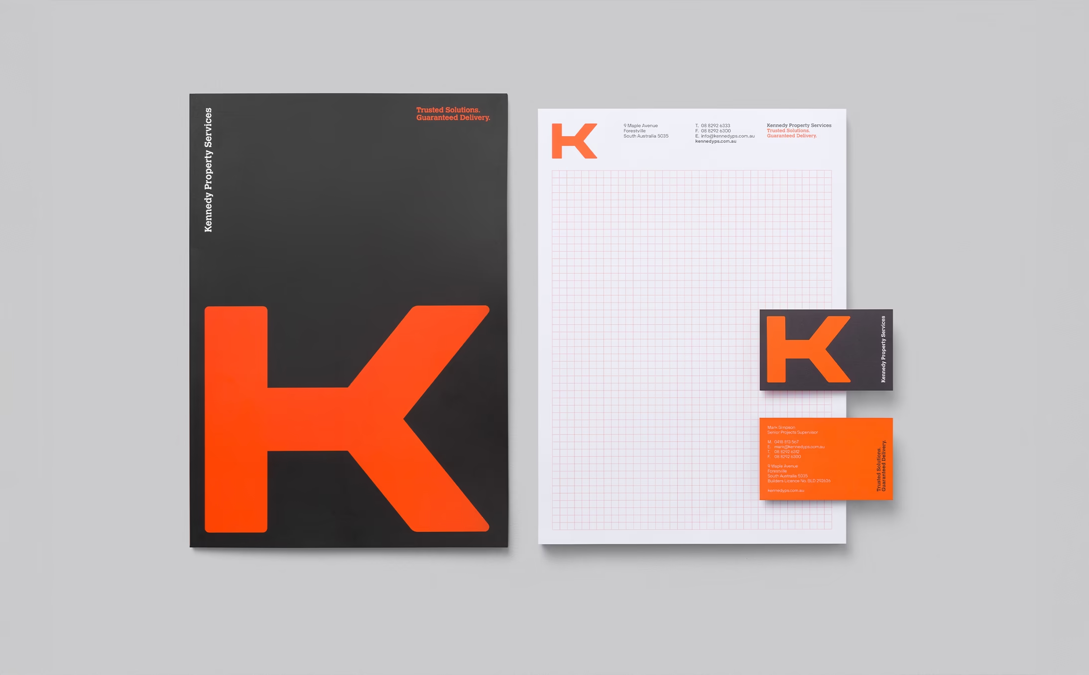
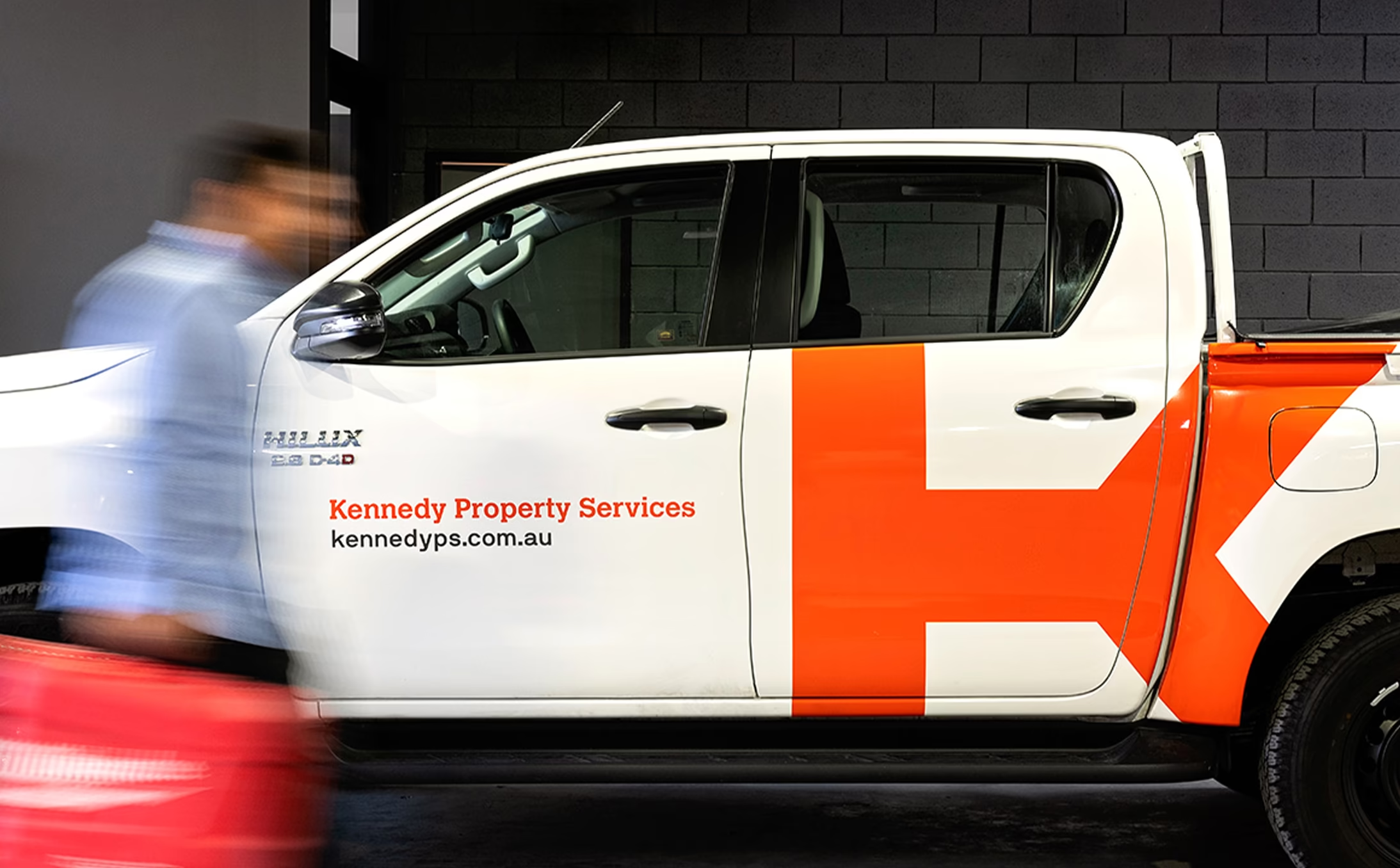
Scale wins in the real world. Our oversized orange K turns every Kennedy van into a moving landmark, building recognition in seconds and memory over months. On site hoardings, uniforms and the website, the same bold code does the heavy lifting—one cue, many contexts. It’s simple, efficient and unmistakably Kennedy, helping the team show up with confidence while the brand does what it should: be seen, be remembered, be chosen.
The business was known more by name than by meaning. Growth had historically come through the previous owner’s personal network, limiting scalability and resilience. To expand into construction and fit-outs, Kennedy needed salience and credibility — brand memory cues that would stick, travel, and compound across the category’s noisy physical environment of sites, roads and depots.
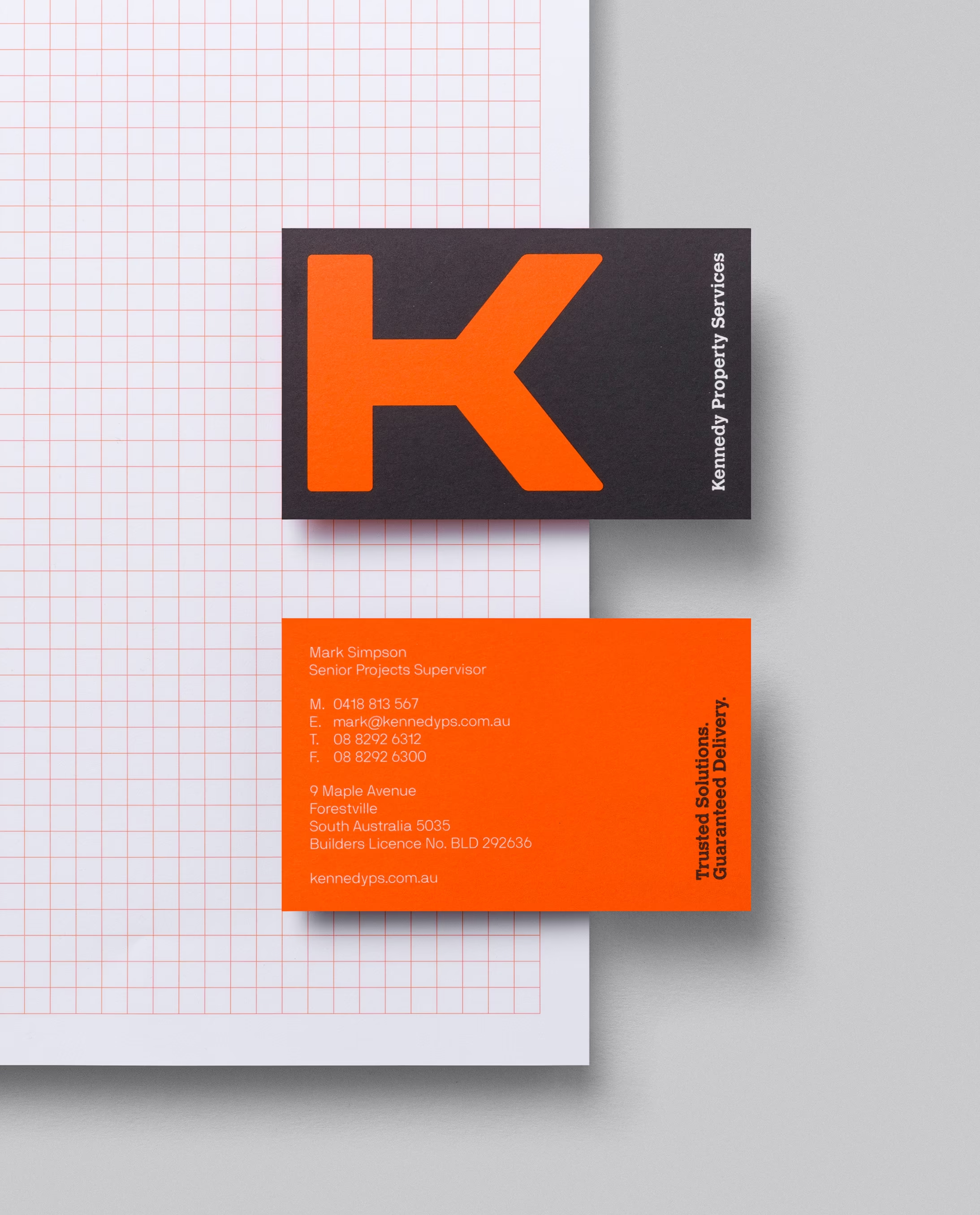
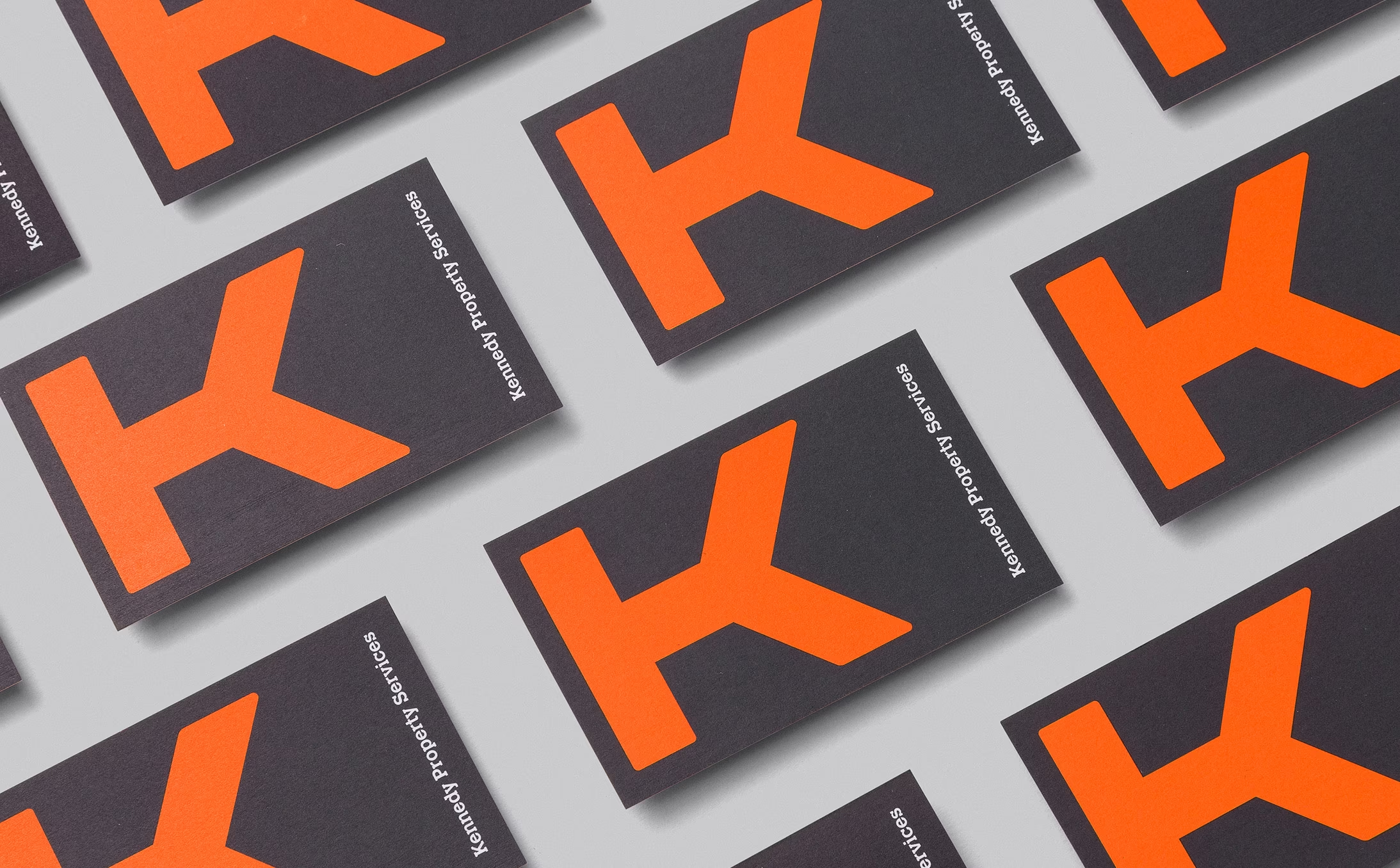
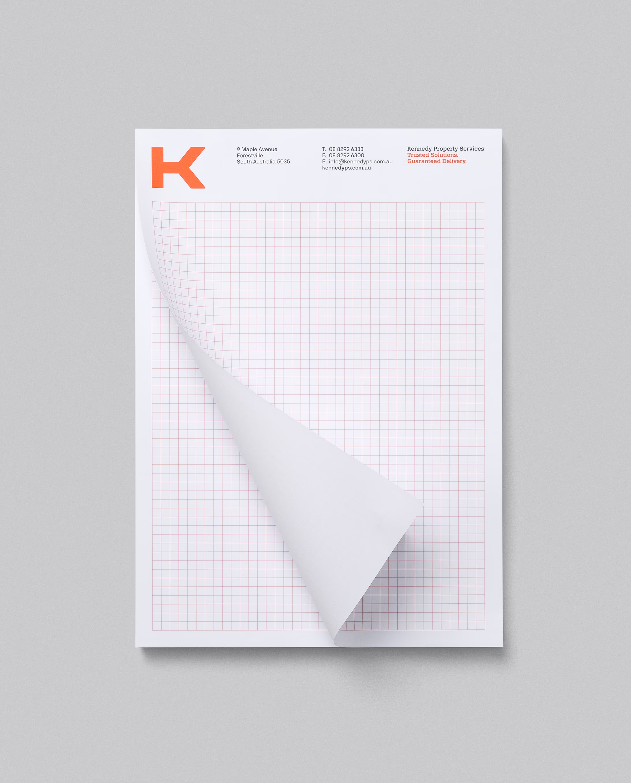
Guided by marketing science, we prioritised distinctiveness and mental availability over incremental design tweaks. We developed a highly visible “big brand, big canvas” system anchored by an oversized orange K — simple, high-contrast, and enormously legible at speed and distance.
The fleet became a broadcast channel; every van functioned like a billboard, multiplying exposures and building fluent recognition across Adelaide and beyond. The system scaled cleanly to stationery, signage, uniforms and a performance-focused website, reinforcing consistent codes that help memory form and retrieve quickly (shape, colour, letterform). The result: a modern, confident identity that makes the brand easy to find, easy to recall, and easy to choose.
Kennedy’s transformation shows how evidence-based brand design can unlock growth. By aligning strategy, identity and operations, we created a system that behaves as well as it looks — and delivers at every touchpoint. If your brand needs to move beyond legacy perception and compete with clarity, we can help you design for scale, recognition and long-term performance.