We create brands that are deeply connected to vision, rich with meaning, and crafted to inspire, align, and endure. Beautiful Brand Intelligence.

Jeanneret Wines sits in a landscape where every vintage is shaped by the season. The winemaking is honest and responsive to the conditions, not imposed on them. Our task as an Adelaide-based branding agency was to build an identity and packaging system that worked in the same way.
Rather than treating the labels as decoration, we treated them as a precise expression of place, time and process. The existing nautilus symbol, tied to the Golden Ratio and family links to architect Le Corbusier, provided both a story and a structural idea. From there we developed a strategic brand and design system that connects proportion, nature and craft, and gives Jeanneret a distinctive position in a crowded wine aisle.
Jeanneret Wines
Food & Drink
Brand identity refinement, including new marque and supporting assets
Packaging strategy for current and future ranges
Label design system for core and seasonal wines
Golden Ratio grid and layout framework for all packaging
Typographic hierarchy and information architecture
Colour system for varietal and range differentiation
Art direction for supporting collateral and imagery
Brand guidelines for ongoing implementation


Jeanneret had equity in its previous mark and story, but the brand lacked cohesion and impact on shelf. The range was growing, vintages were shifting each year, and the labels were not working as a unified system.
We needed to create a brand platform and packaging language that respected the legacy of the nautilus, expressed the winery’s connection to nature and proportion, and could flex seamlessly across varieties, vintages and future releases. The solution had to be both distinctive and disciplined, giving the team a clear design framework rather than a series of one-off label designs.
We began by reframing the nautilus as a living asset rather than a fixed icon. The mark was simplified into a stylised J that retains the spiral idea while feeling more confident and contemporary. Curved, vine-like elements echo the surrounding landscape, connecting the symbol with the physical environment of the vineyards.
Underneath the identity we built a strict grid based on Golden Ratio proportions, a respectful nod to the family’s Le Corbusier connection and his use of natural proportion systems. This grid governs label structure, typography, and information hierarchy. It ensures every wine feels part of a single, strategic system rather than a collection of individual artworks.
Typographically, we drew from Swiss-Modernist principles: clean, rational, clear. Variety, vintage and winemaking detail sit at the centre of the composition. Growing conditions and key process notes are elevated from back-label fine print to primary storytelling. Drinkers can now see, as well as taste, what makes each bottle different. Colour is handled through a restrained palette derived from modernist colour theory and the Clare Valley landscape, creating recognition across the range while allowing for subtle cues between varietals.


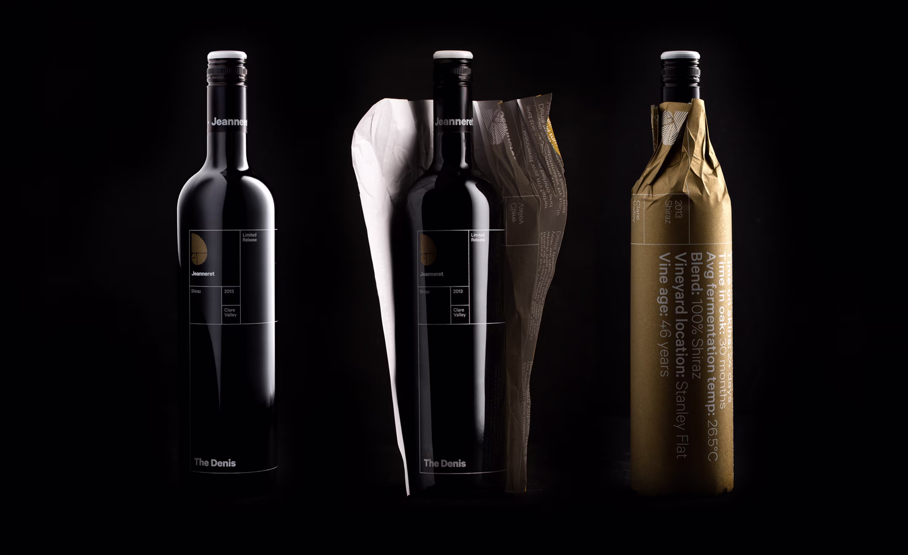
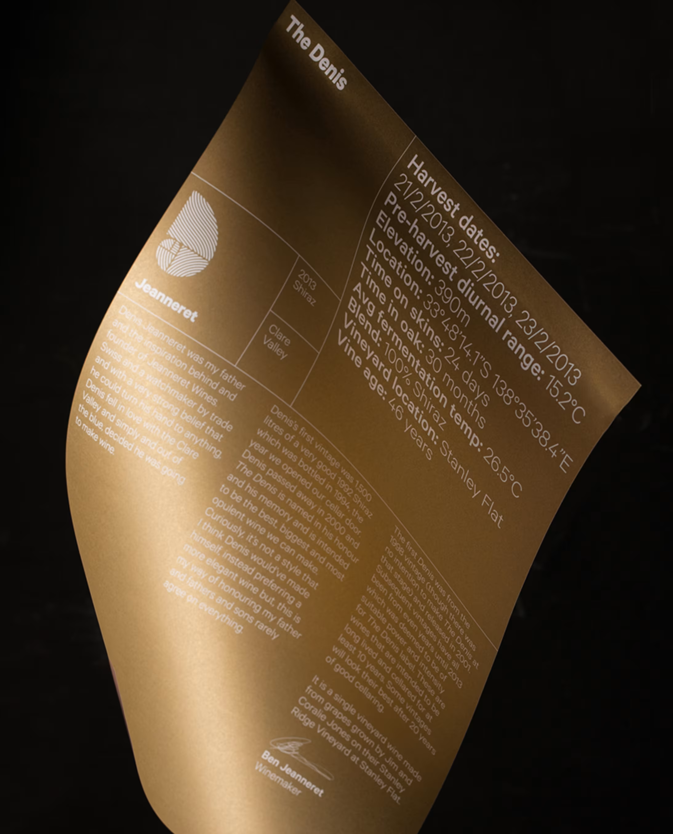
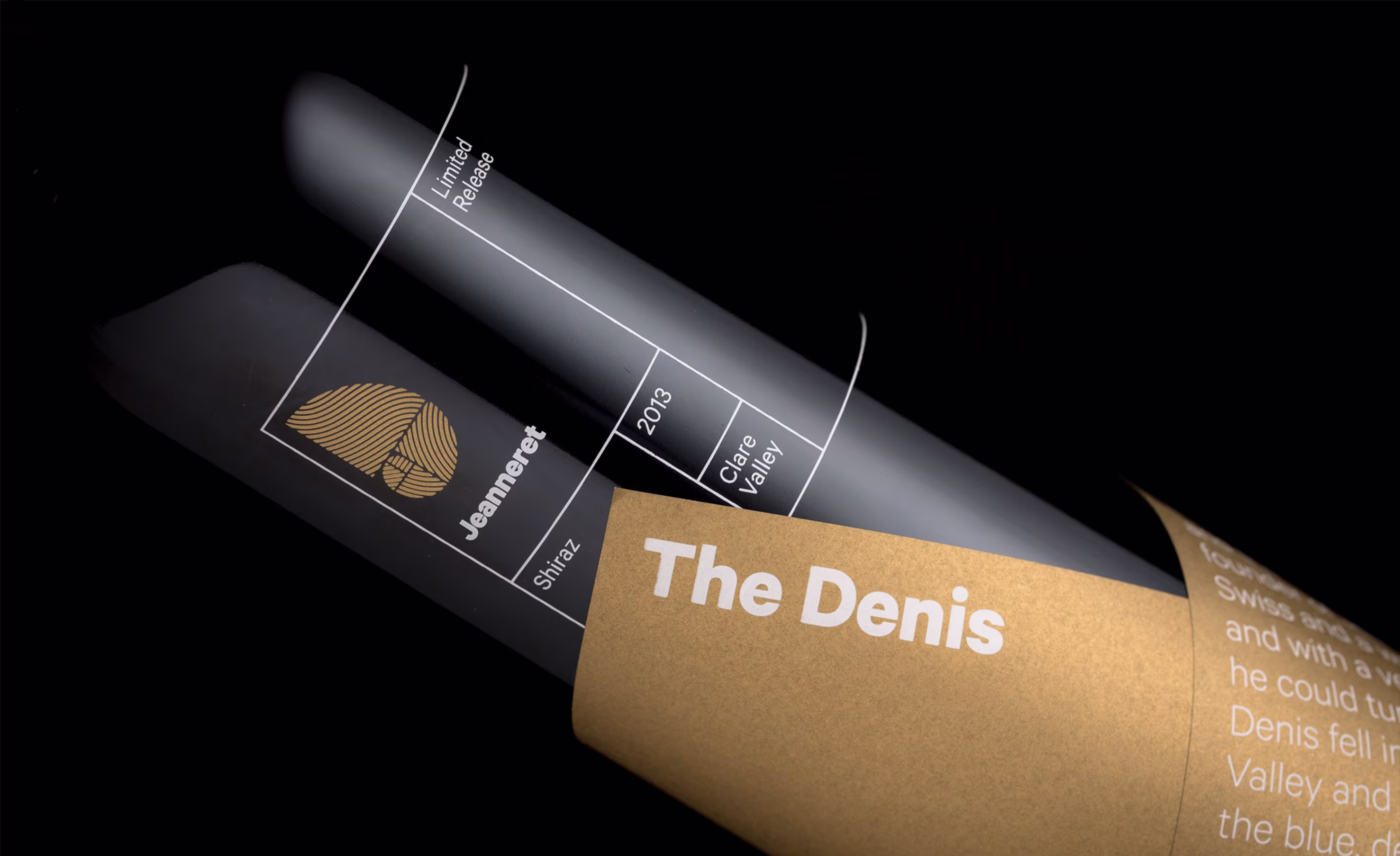
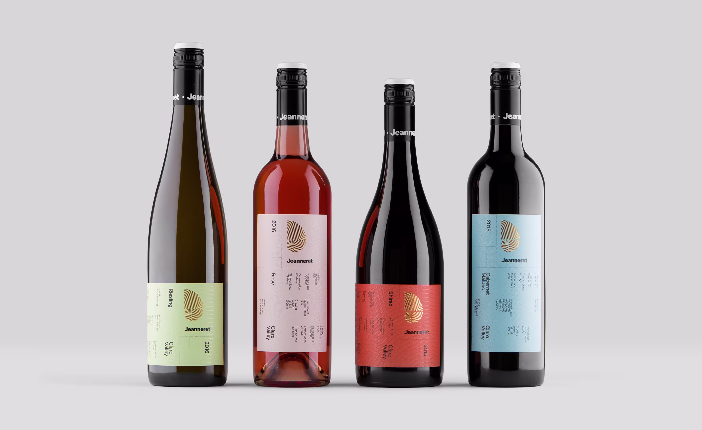
Jeanneret Wines now has a brand identity and packaging system that is as considered as the wine itself. The combination of strategic brand thinking, clear design rules and purposeful art direction gives the winery a platform it can grow with, without diluting what makes it unique.
For StudioBand®, this project demonstrates how a design-led, evidence-based approach can turn an existing symbol into a complete brand system that supports recognition, storytelling and commercial performance.
If you are ready to create a brand with long-term impact, get in touch. Explore more of our food and drink branding work, or learn more about our strategic branding and design services for ambitious organisations.