We create brands that are deeply connected to vision, rich with meaning, and crafted to inspire, align, and endure. Beautiful Brand Intelligence.
Haku Massage and Wellness is a South Australian business with locations in Glenelg and Adelaide CBD. Known for its holistic approach to wellbeing, Haku combines massage and beauty therapies with traditional Japanese philosophies of balance, simplicity, and harmony. Their services span remedial and relaxation massage, head spa treatments, and Japanese beauty therapies such as Cellulam®.
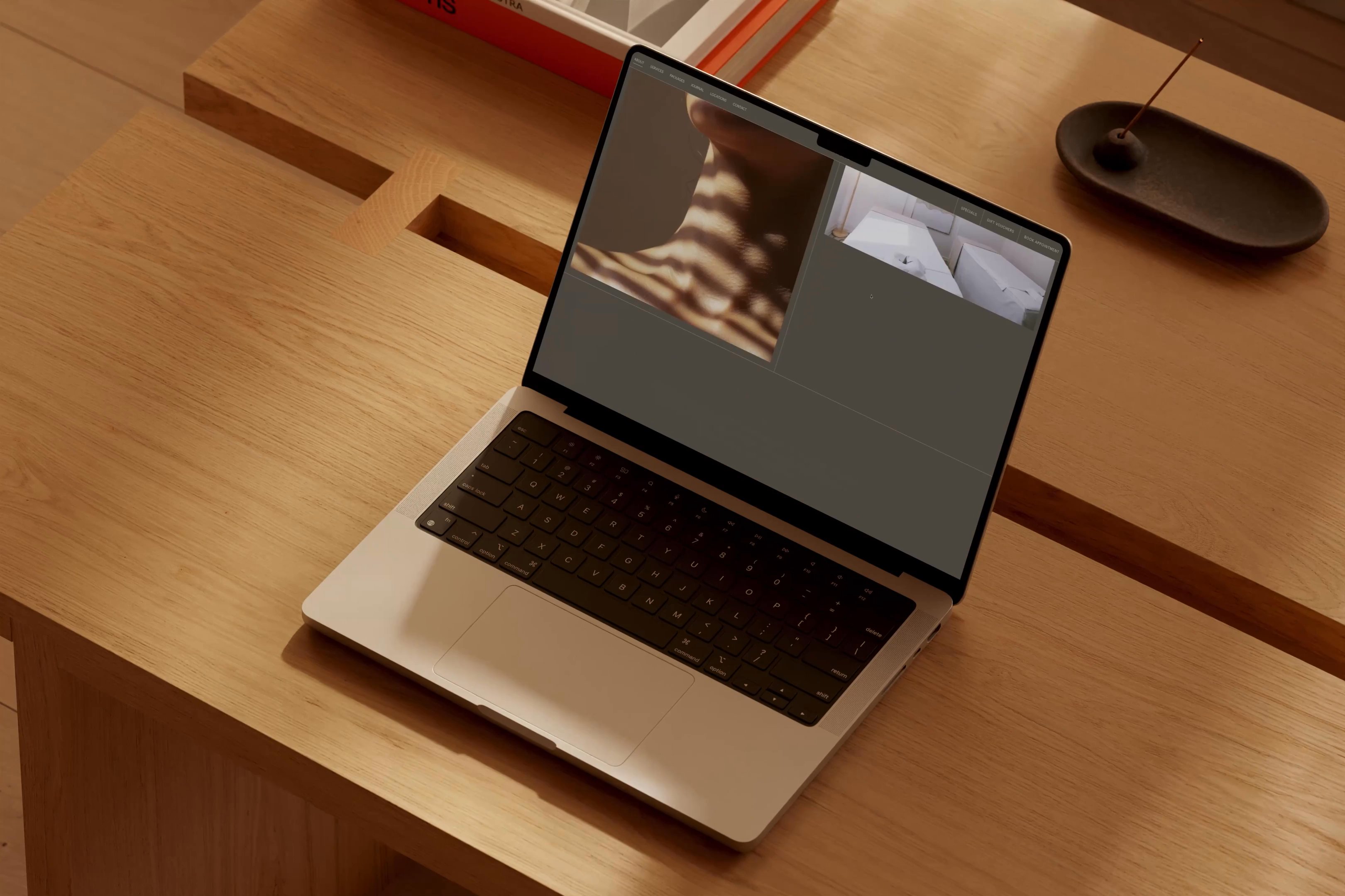
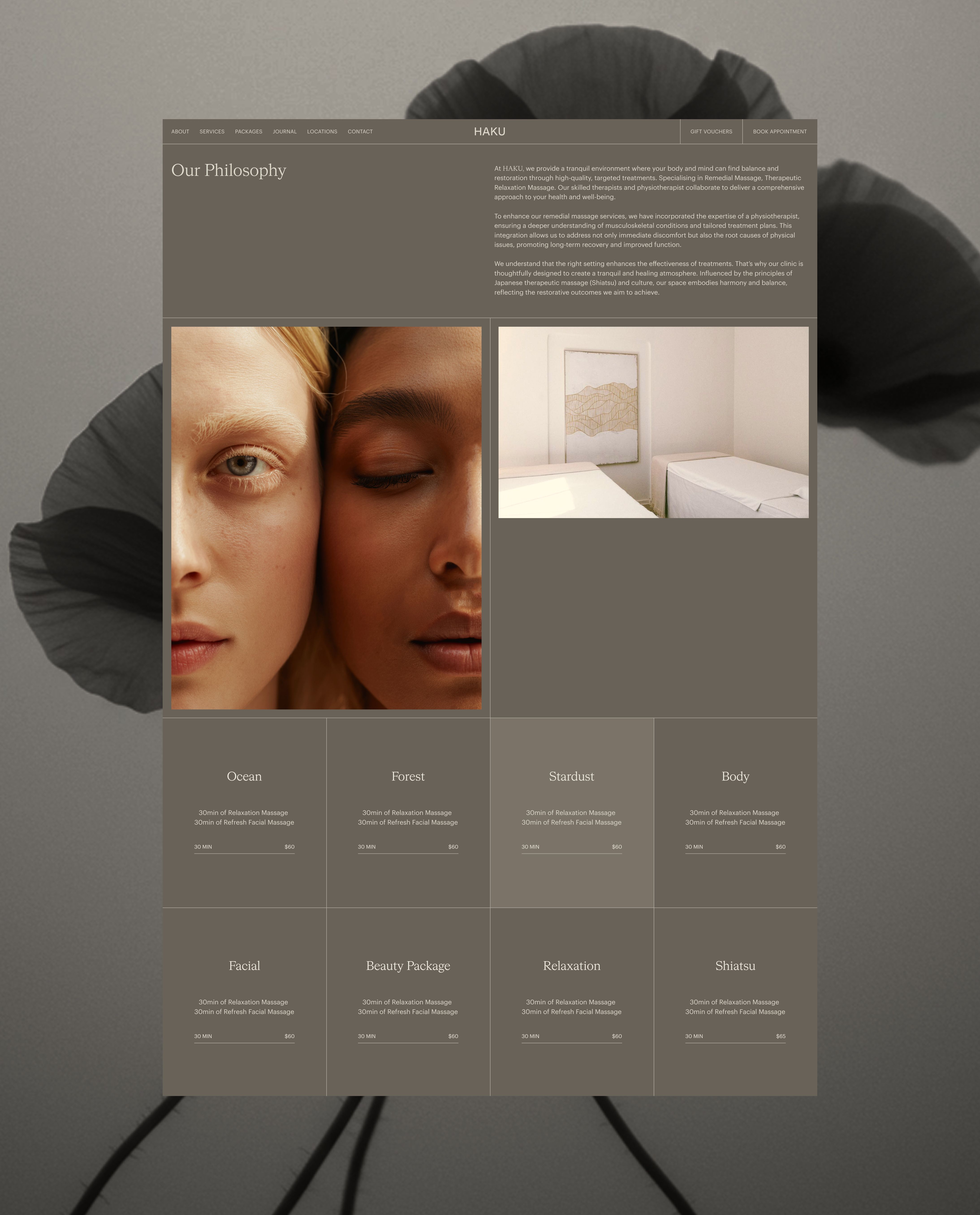
When Haku approached StudioBand®, their goal was clear: to create a digital presence that not only functioned seamlessly but also authentically expressed their cultural philosophy. The brand needed to move beyond service listings and transactional booking flows, instead offering a user experience that reflected the artistry, ritual, and restorative nature of Japanese wellness traditions.
Haku Massage & Wellness
Health & Wellness
Website strategy and design
Website development
Art direction and photography
User experience and navigation design
Lead capture and conversion pathways

The refined Haku wordmark is a study in Japanese simplicity. Built on a 4×4 grid system, the design balances clarity, restraint, and harmony. Each letterform was considered with care, ensuring the mark not only reflects Haku’s cultural philosophy but also enhances its distinctiveness in a crowded wellness market. By reducing excess and amplifying precision, the wordmark embodies the spirit of balance and calm that sits at the heart of Haku’s brand. It is a reminder that design can be both functional and deeply symbolic.

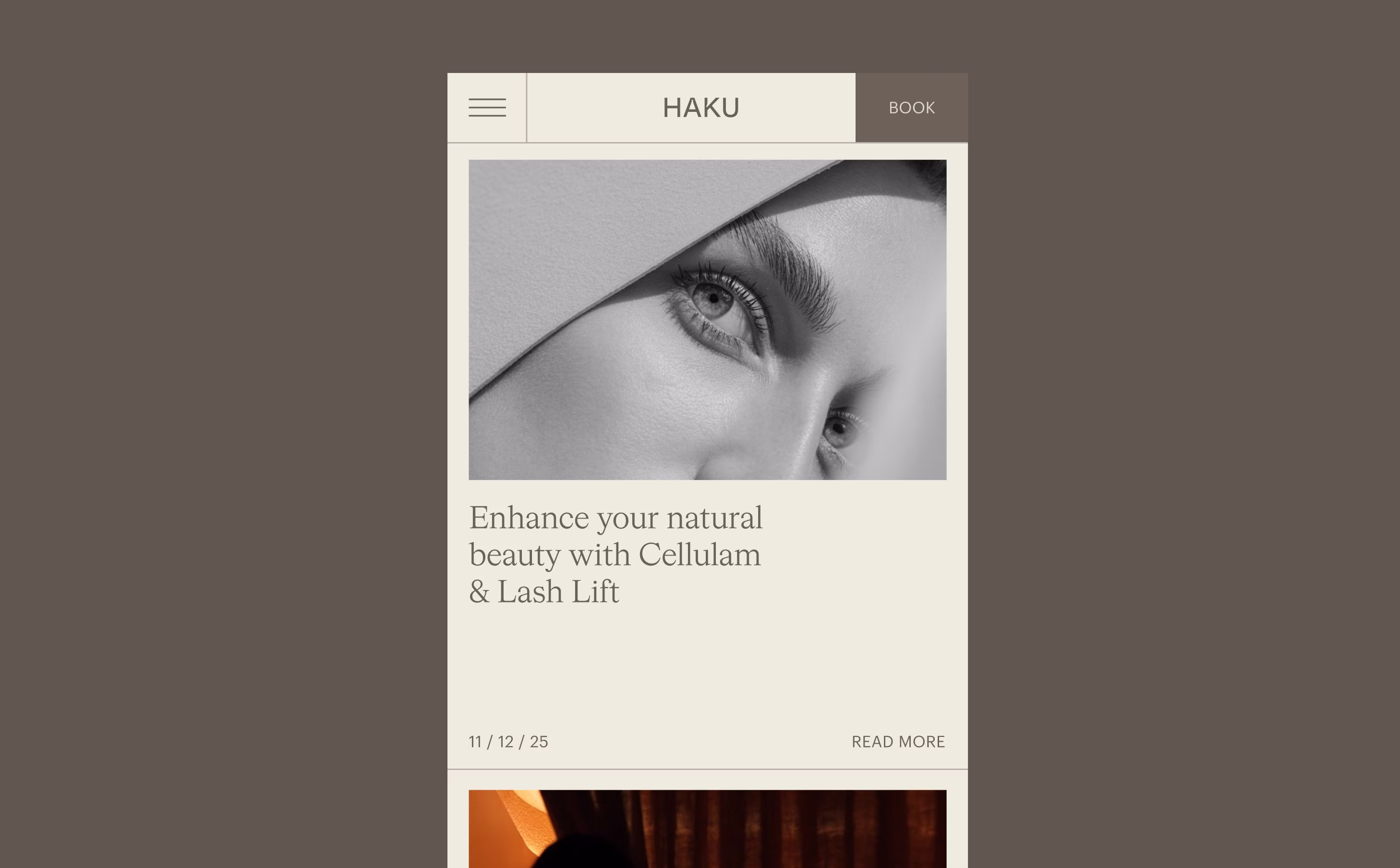
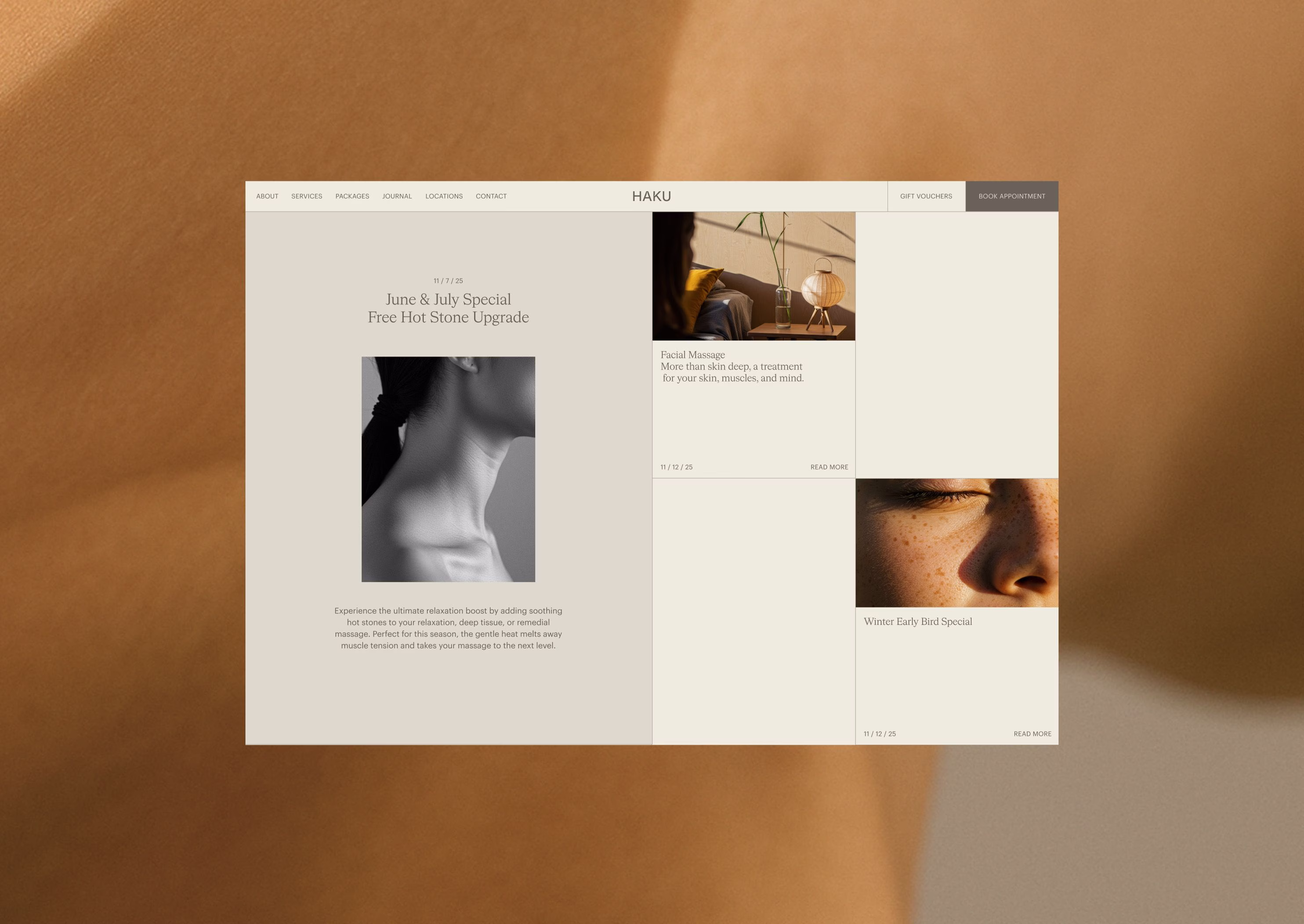
Haku’s journal captures more than updates; it reflects their values, stories, and inspirations. By weaving reflections and narratives into the site, we gave the brand a living space to share its philosophy beyond treatments. This approach not only strengthens audience connection but also positions Haku as a thought leader in wellness, demonstrating authenticity and cultural depth. For users, the journal becomes a point of discovery, a way to connect with the brand’s personality and beliefs while gaining meaningful insights into holistic wellbeing.
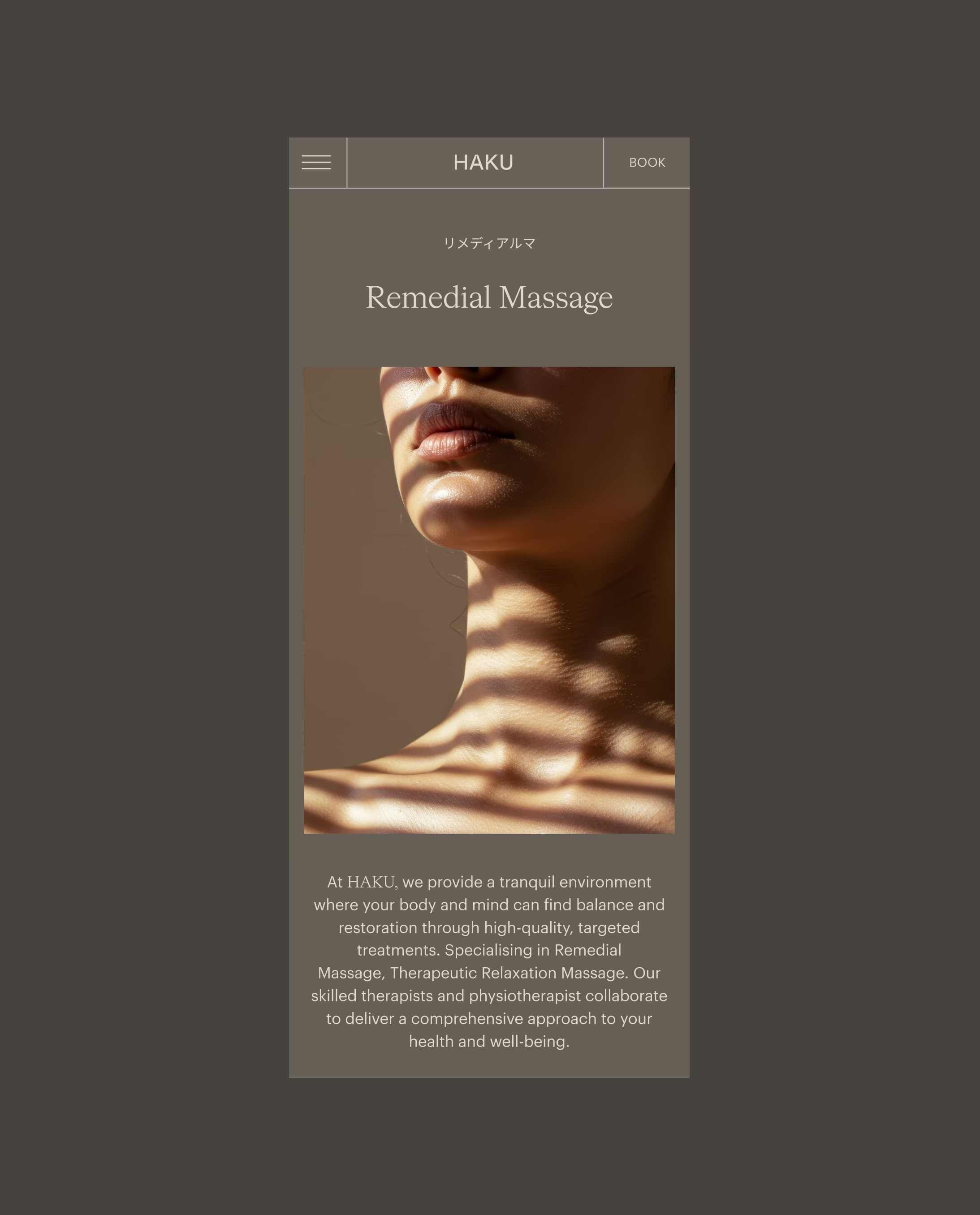
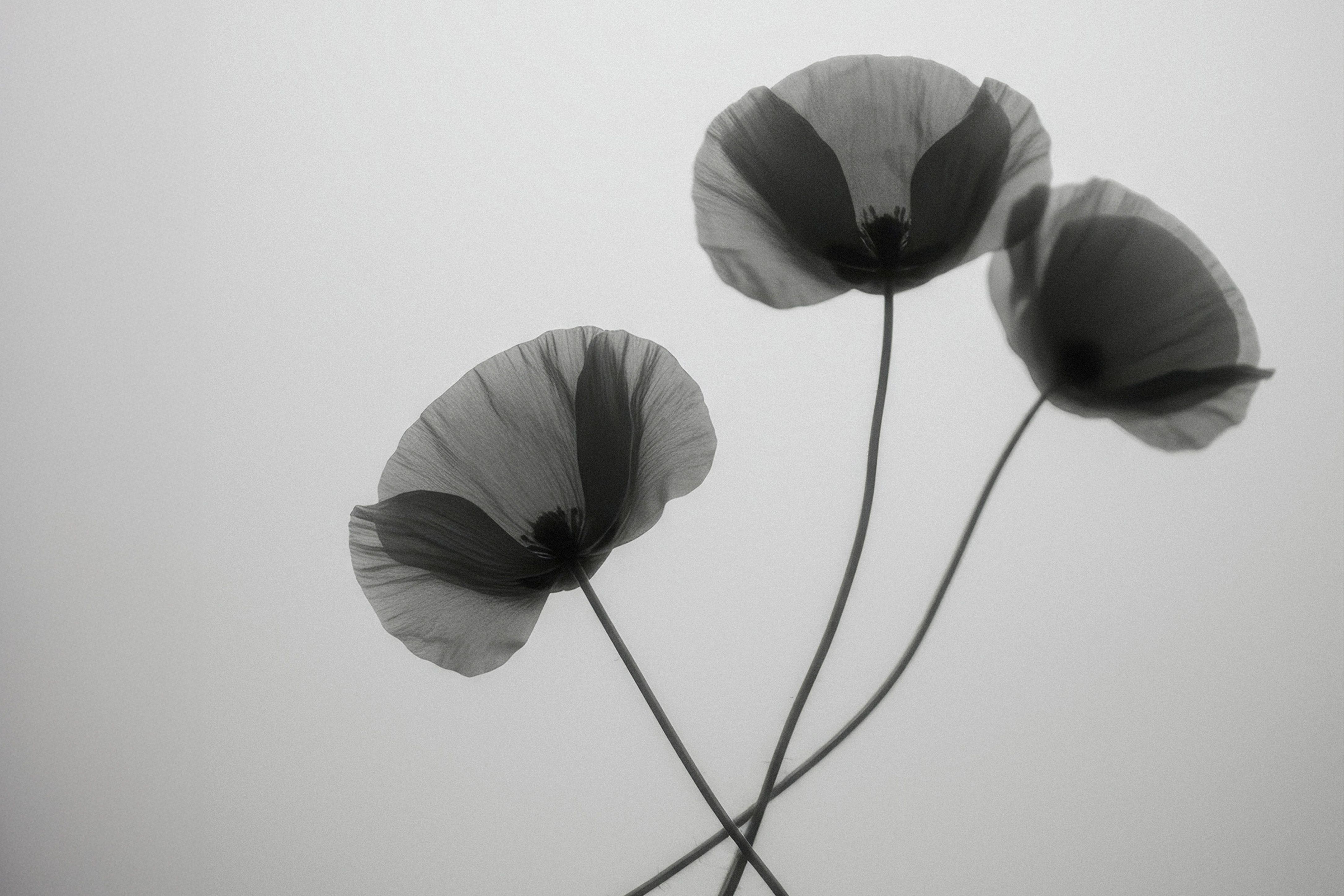
Our approach centred on embedding Japanese minimalism into every aspect of the design. This meant using refined art direction, purposeful space, and balanced layouts to create a digital environment that felt calm and intentional.
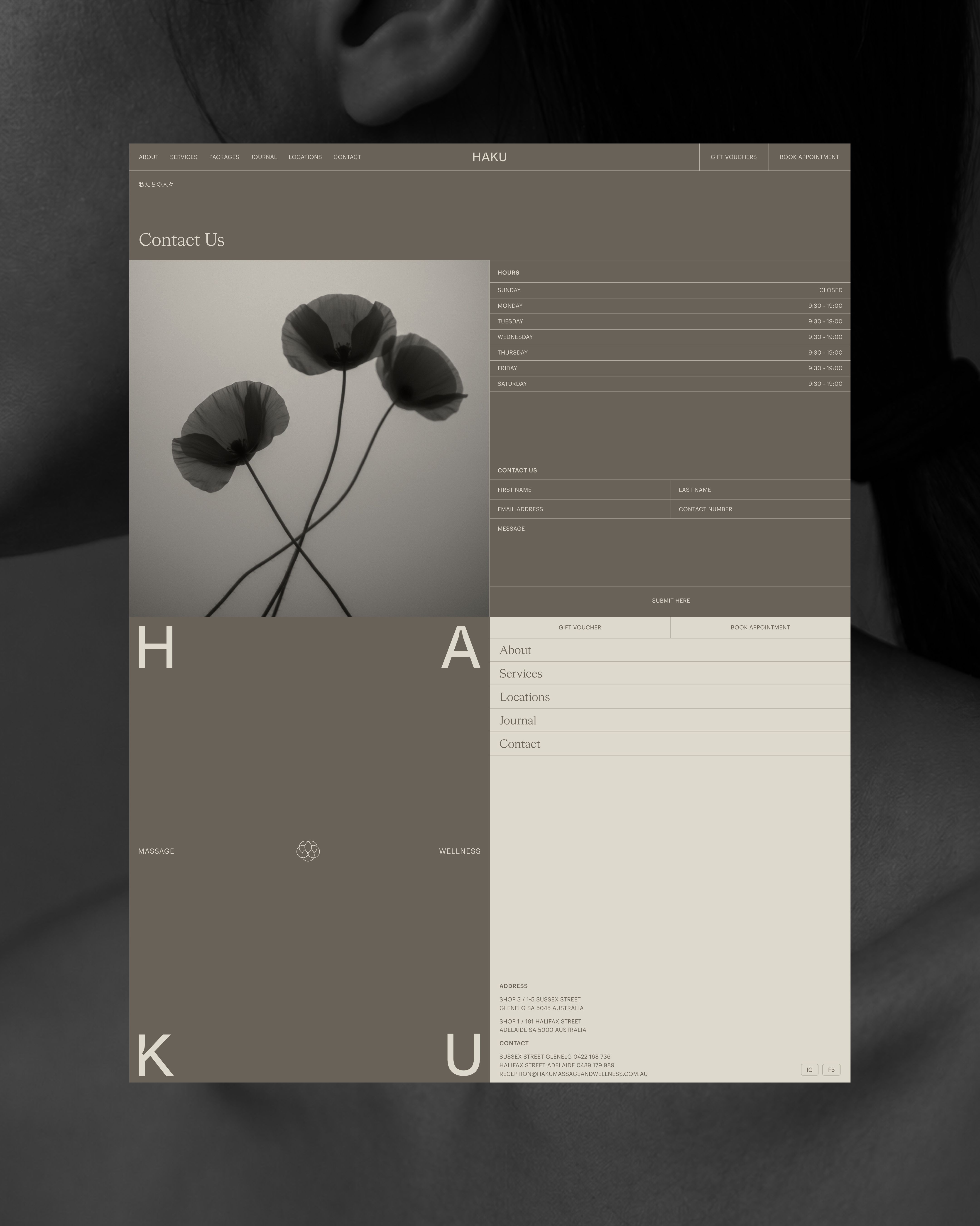
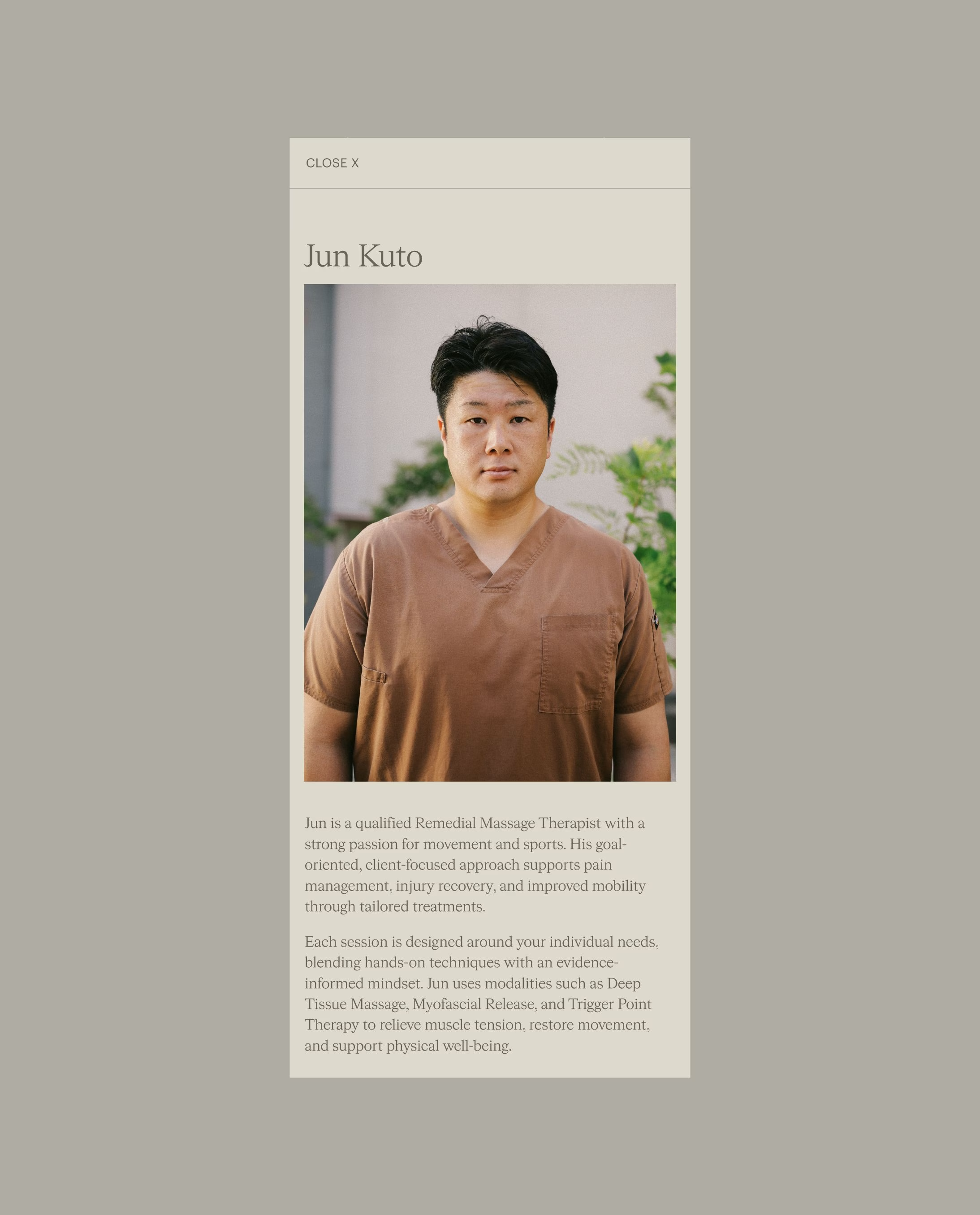
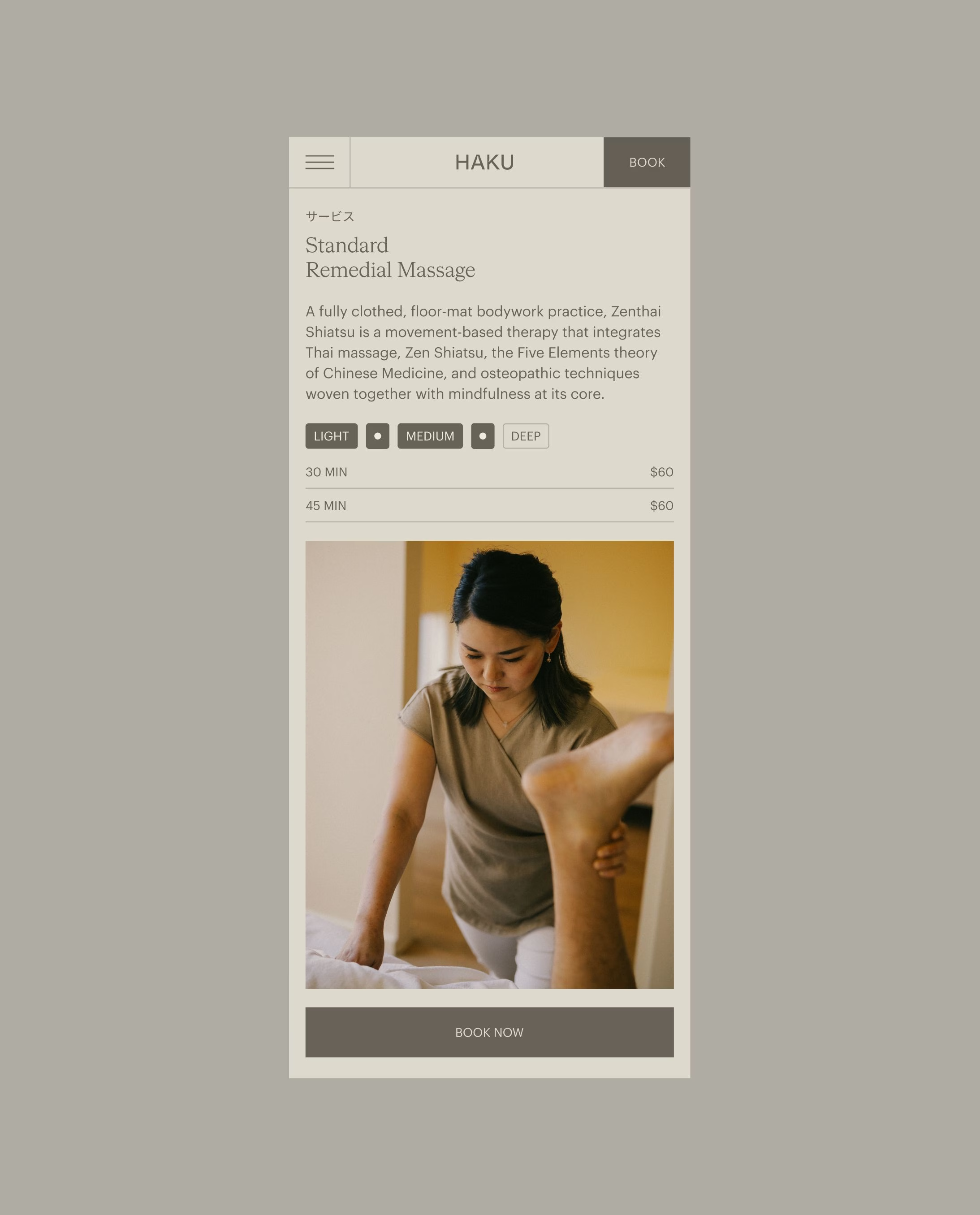
We designed a new wordmark built on a 4×4 grid system, bringing precision, restraint, and harmony to the letterforms. This became a subtle yet powerful reflection of Haku’s values. The website itself was restructured to guide users effortlessly, showcasing treatments clearly and creating smooth pathways to bookings. Lead capture mechanisms were integrated to convert curiosity into connections, supporting both brand engagement and business growth.
Haku required a digital refresh that could authentically capture the depth and subtlety of their Japanese inspired philosophy while still delivering a robust and highly functional online platform.
Their previous website did not provide the clarity needed to highlight individual services, nor did it offer the visual distinction required to reinforce and strengthen the uniqueness of the brand identity. The challenge lay in finding the right balance between meaningful cultural storytelling and user centred design principles, creating an online environment that felt as evocative and culturally resonant as it was seamless, intuitive and easy to use.
The Haku refresh is more than a website update — it’s a digital embodiment of balance, harmony, and simplicity. By combining cultural authenticity with user-centred design, we helped Haku elevate its presence as a trusted leader in massage and wellness.
AADC Awards Finalists - Digital Design