We create brands that are deeply connected to vision, rich with meaning, and crafted to inspire, align, and endure. Beautiful Brand Intelligence.
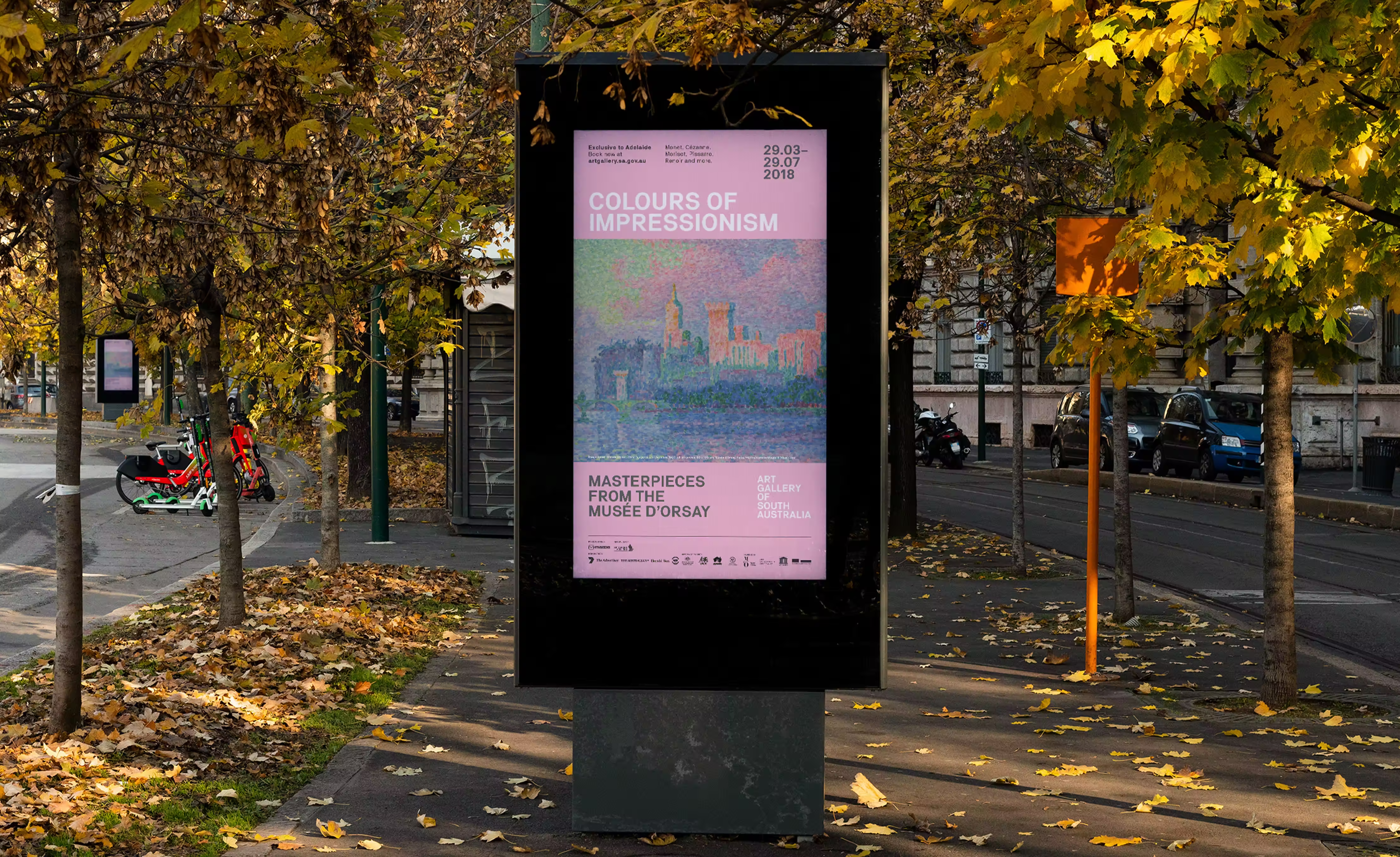
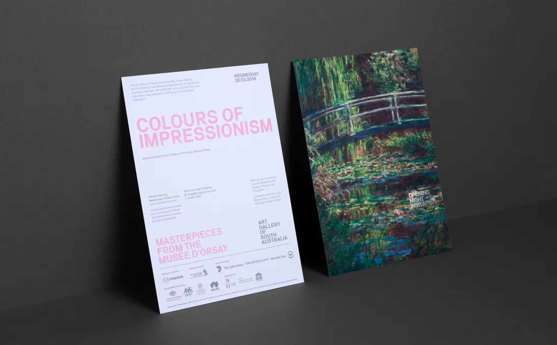
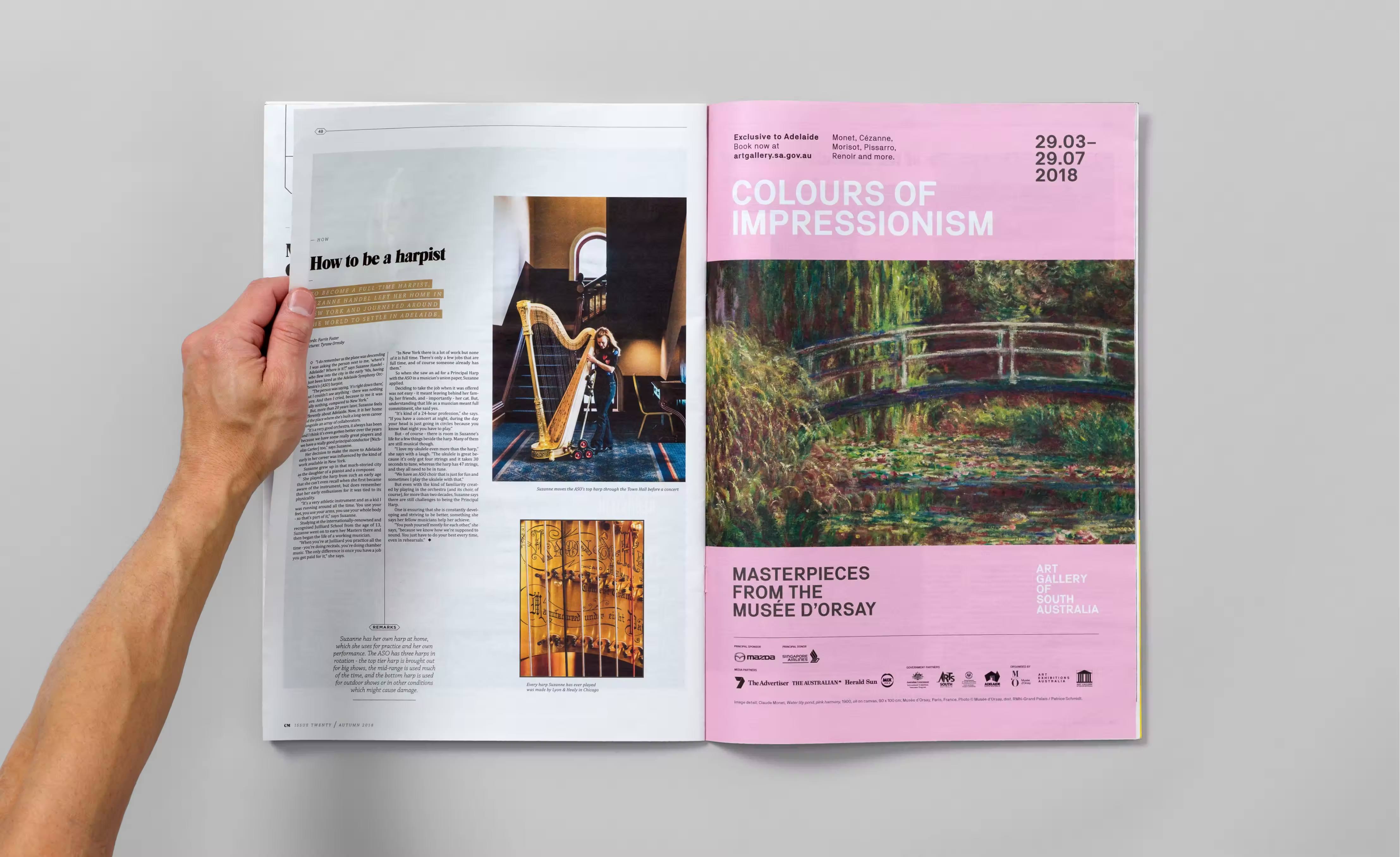
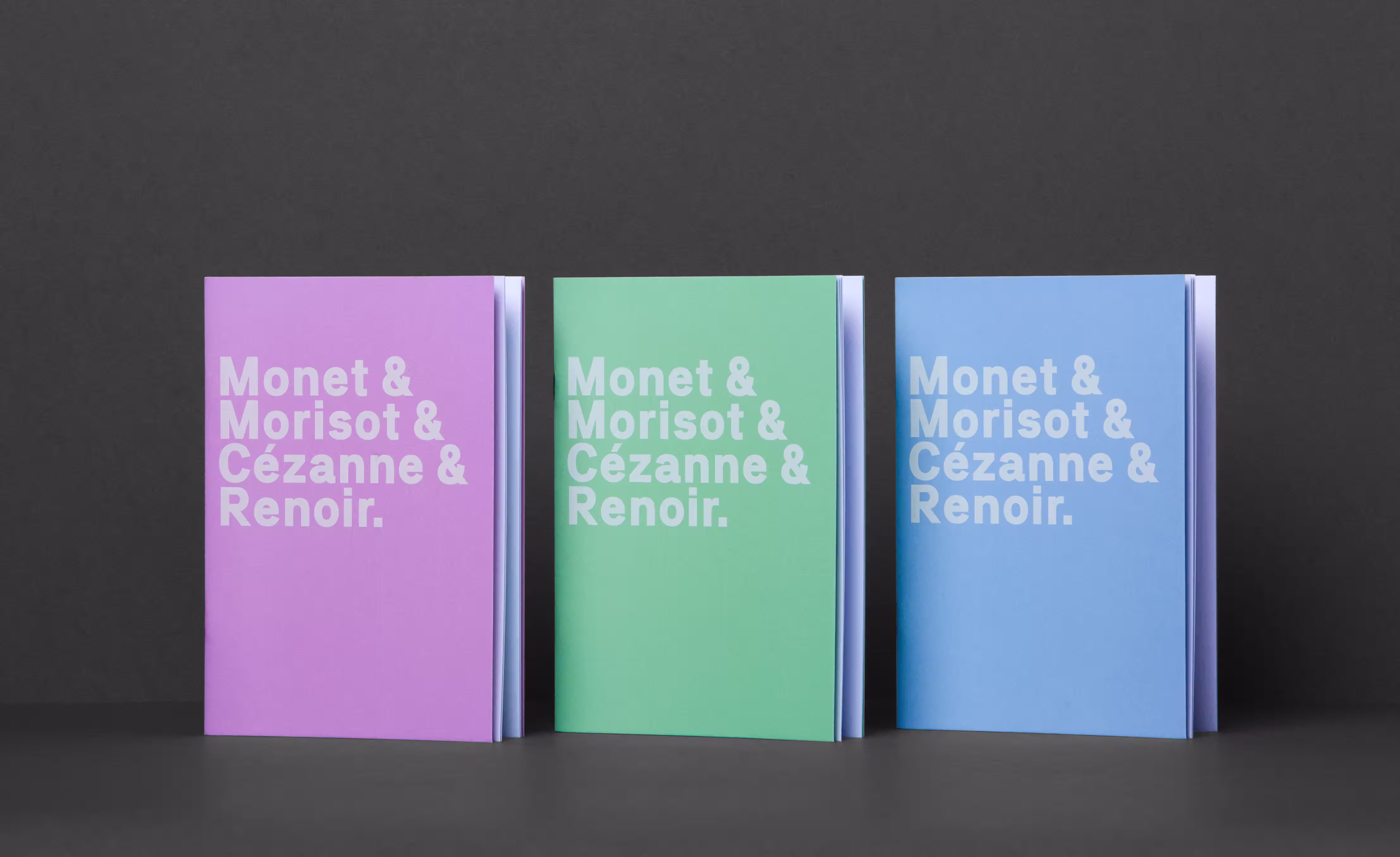
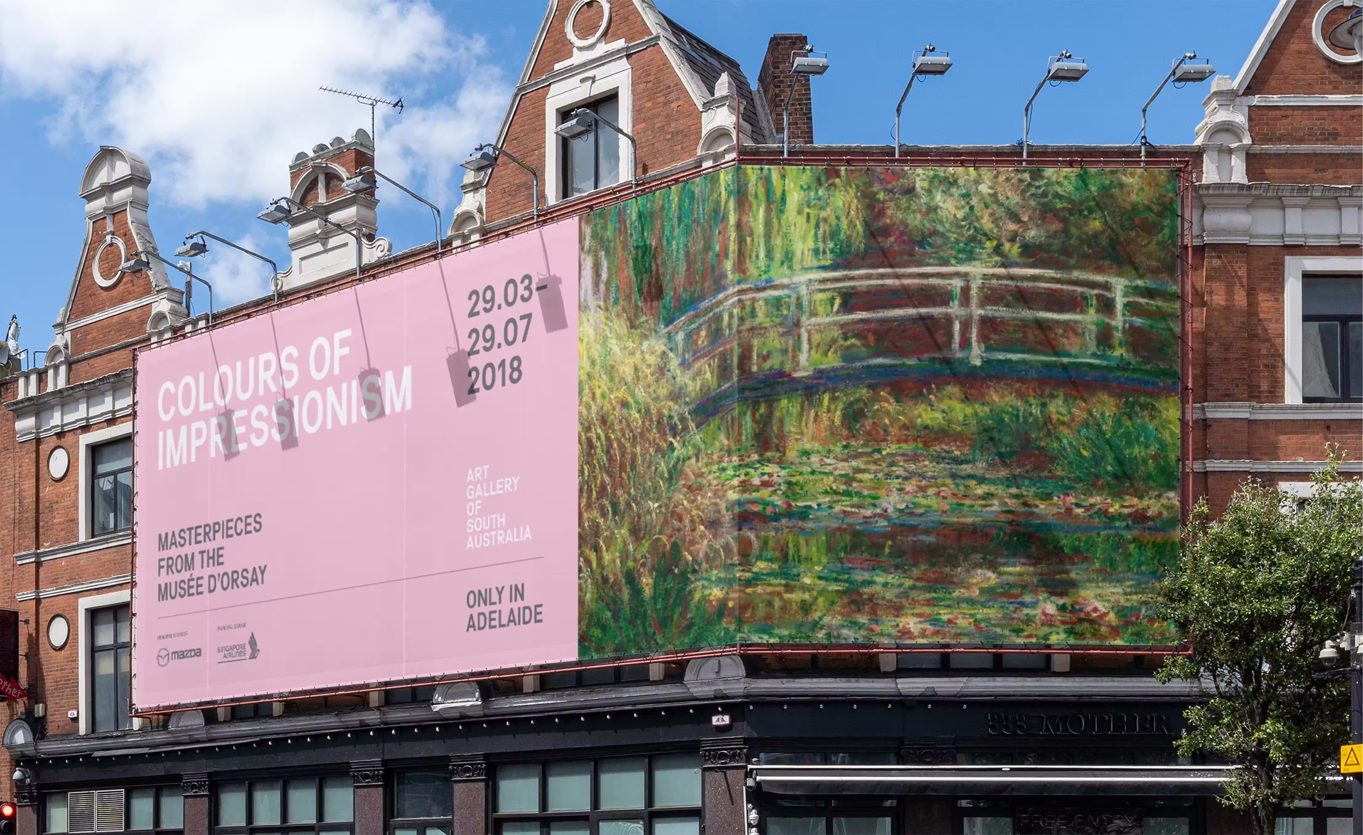
Colours of Impressionism brought 65 masterpieces from the Musée d’Orsay to Adelaide. StudioBand® was engaged to create a campaign identity and exhibition system that honoured the work while standing out within a competitive cultural calendar.
Rather than relying on period pastiche, the approach centred on a contemporary, high-contrast visual language defined by a singular colour signal and a confident typographic voice. The system was designed to scale seamlessly across touchpoints — from trams and out-of-home to wayfinding, tickets and the exhibition book — while remaining unmistakably AGSA.
Art Gallery of South Australia
The Arts
Campaign branding and visual system
Exhibition graphics and wayfinding
Advertising and marketing collateral (print, digital, social)
OOH including tram wrap and large-format billboards
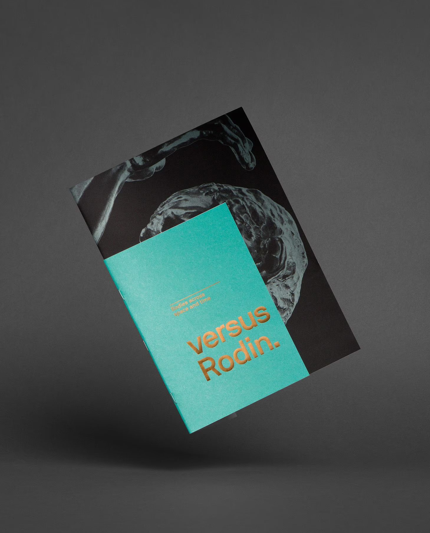
Exhibition book design
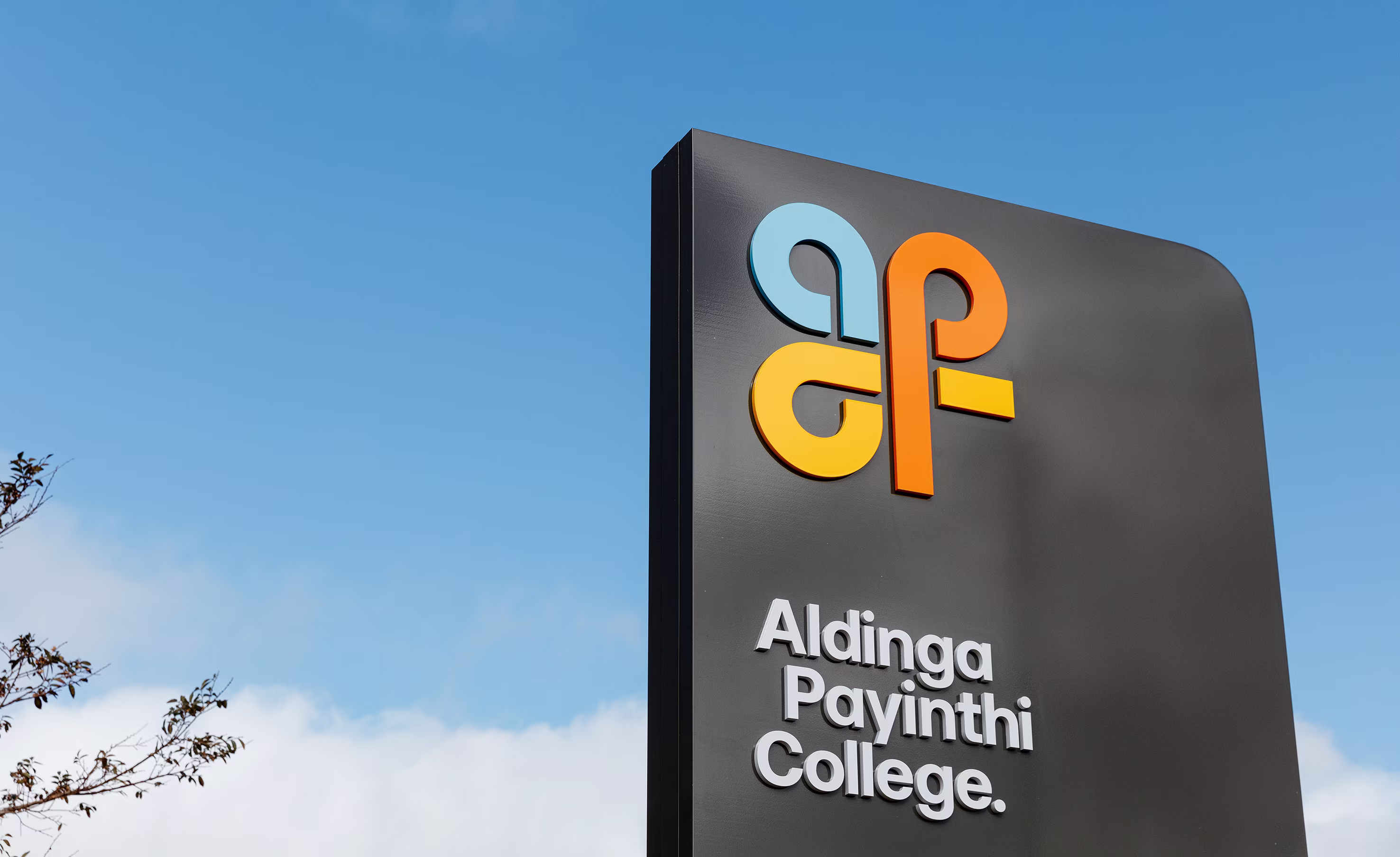
Site and entry signage
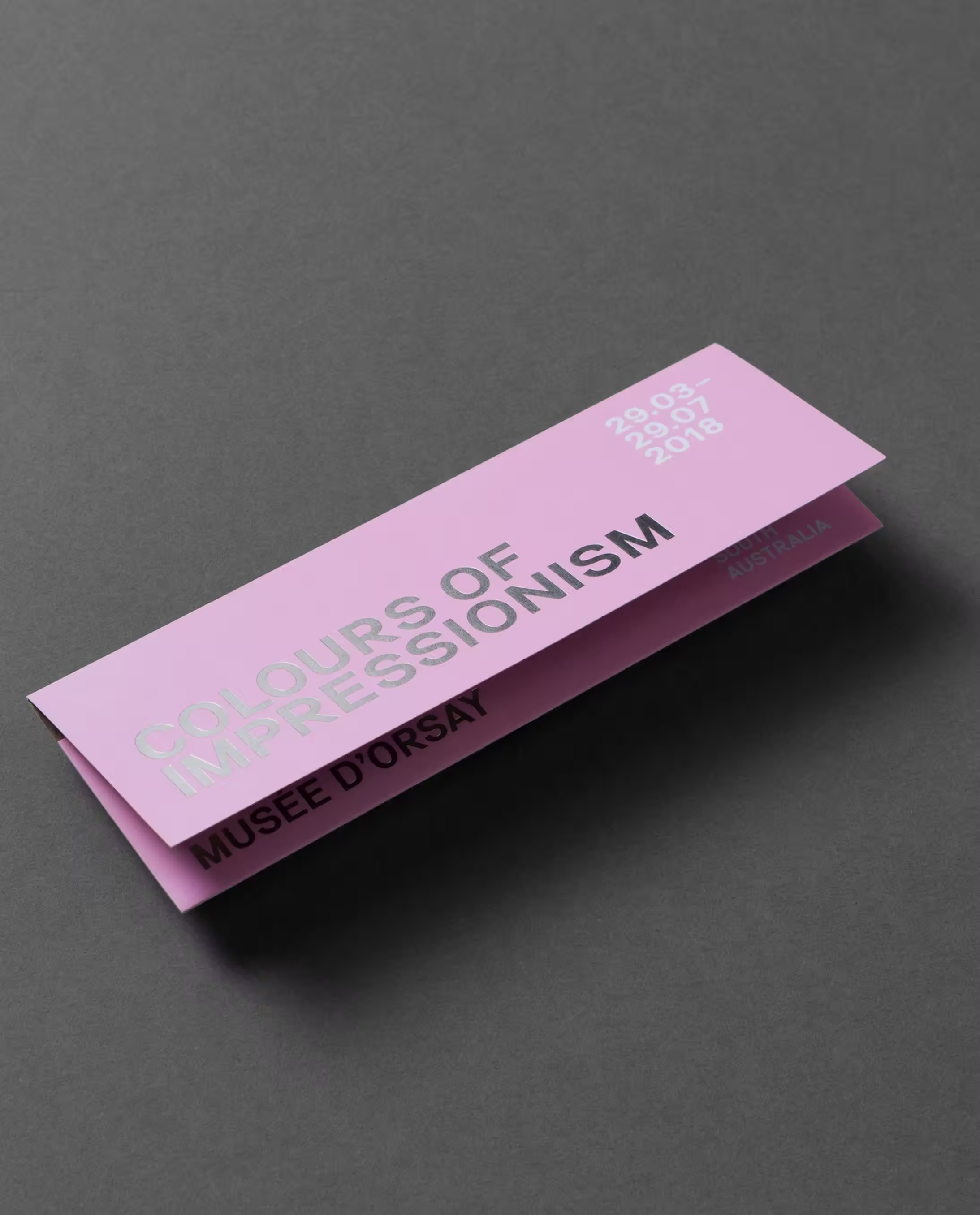
A single idea, everywhere. The pink wasn’t decoration; it was a decision. On the tram, in the banners, across the book and wayfinding, that colour did the heavy lifting — capturing attention at speed, anchoring memory, and signalling a fresh take on Impressionism. Pairing it with strong typography and disciplined layouts meant every touchpoint felt related, recognisable and ready to deploy. The outcome was a campaign that people could spot from a block away and recall weeks later — proof that distinctive assets, used consistently, do the hard work of marketing.
In a saturated cultural landscape, visibility and memorability were critical. The identity was built around a bold, ownable colour and a restrained yet assertive typographic system — creating a clear and immediate point of recognition across all applications.
This decision moved the campaign away from expected, referential aesthetics and toward a more contemporary expression, allowing the exhibition to feel current, confident and visually distinct within its category.
The campaign needed to perform across a wide range of formats, environments and timelines. We developed a flexible design system that could adapt from large-scale outdoor placements to detailed exhibition collateral without losing clarity or consistency.
Grid structures, typographic rules and colour application were carefully defined to ensure ease of use across internal teams and partners, supporting efficient rollout while maintaining a cohesive visual presence throughout the campaign.
The campaign delivered record ticket sales for AGSA, exceeding forecasts and extending the exhibition season. Consistent use of distinctive visual assets strengthened recognition across touchpoints, supporting sustained audience engagement throughout the campaign period.
The result is a system that not only captured attention, but maintained it — reinforcing AGSA’s presence within the cultural landscape while demonstrating the impact of a clear, cohesive campaign identity.
Jonathan VDK
Mark Lobo